26
European Graphic Novels+
1182 readers
26 users here now
“BD” refers to Franco-Belgian comics, but let's open things up to include ALL Euro comics and GN's. Euro-style work & artistry from around the world is also welcome, especially BD-style.
* BD = "Bandes dessinées"
* BDT = Bedetheque
* GN = graphic novel
* LBK = Lambiek
* LC = "Ligne claire"
Please DO: 1) follow good 'netiquette' and 2) the four simple rules of lemm.ee (this instance) when posting and commenting. As for extracts, they're fine, but don't link to pirated downloads.
The designated language here is English, with a traditional bias towards French, followed by other Euro languages.
When posting foreign-language content, please DO include helpful context for English-speakers.
---> Here's the community F.A.Q, and our resource page <---
RELATED COMMUNITIES:
- #bandes dessinées
- r/bandedessinee
- BD on Tumblr
- [email protected]
- Comics on Lemmy
- GN's on Lemmy
- Heathcliff (w/o HC)
- r/noDCnoMarvel
- Moebius_Art
- Moomin Valley
SEARCHES:
# #MAILBOX #Tintin #Asterix #LuckyLuke #Spirou #Gaston #CortoMaltese #Thorgal #Sillage(Wake) #Smurfs #Trondheim #Moebius #Jodorowsky
founded 2 years ago
MODERATORS
27
28
29
Bleu à la lumière du jour has a very haunting, noir-ish feel to the art. The dialogue is sparse, making the big, silent panels even more exaggerated in their quietude. I am still learning French, so I am slowly reading/translating it piece by piece, as sparse as the dialogue is, but am relishing soaking in the sumptuous atmosphere that Gonzalez has sculpted in these panels. Definitely highly recommended.

30
This piece comes from an Austrian art collection book by "Tobihachi," who we're told is a Japanese woman who likes to paint animals in folk costumery. [BDT]
In any case, I love the samples I've seen so far. Here's a couple more from that BDT link:

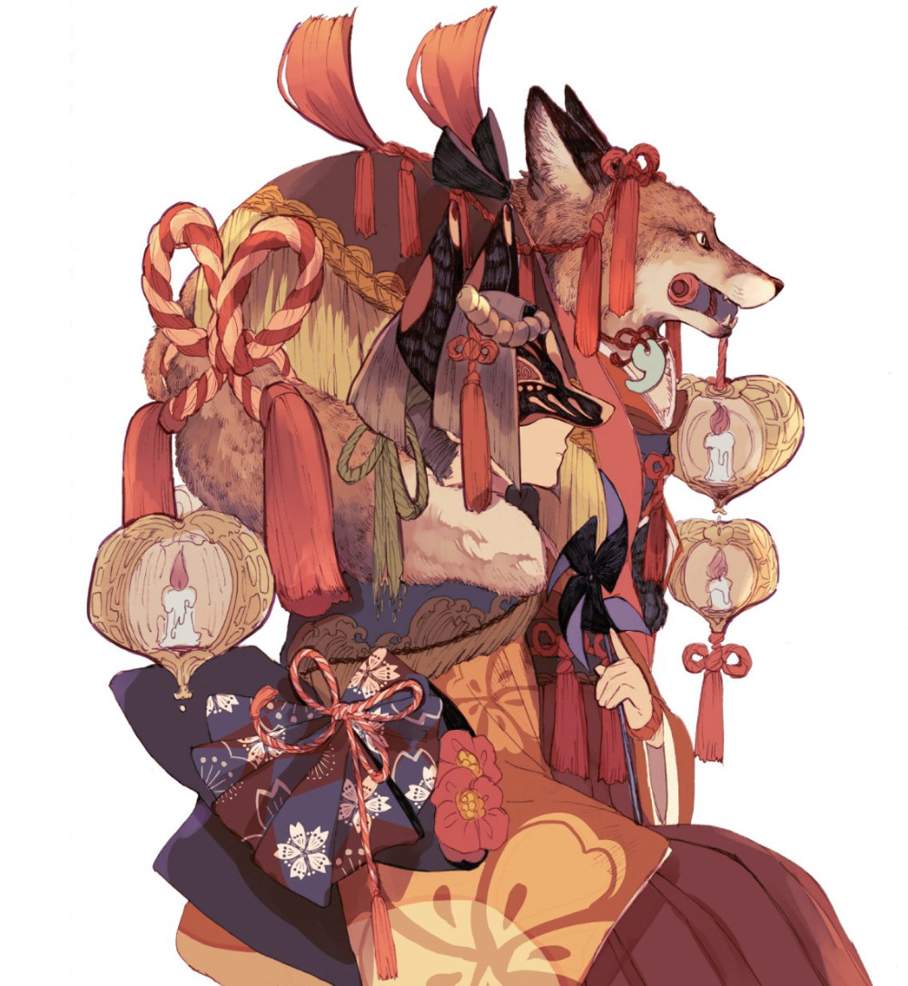
...And a lot more samples via Google:
https://www.google.com/search?q=%22Tobihachi%22+art&udm=2

31
Previous introduction here.
In the above scene, two police detectives are interrogating a literal Satan-worshipper, a man who seemingly reeks of guilt by all that's good and holy, we presume. But what exactly is he guilty of, and how best to corner the beast..?


Now, our heroine as it were is carrying on the tradition of her father, and even though she received top results at the Police Academy, she's immediately treated as a complete joke by her colleagues. Her assigned partner is initially of such a 'boys' club mind,' but soon begins to respect her abilities...


Time to party?
(I think not)

This little two-book work is like the ultimate 'cool cat,' late-60's gem about cultism from the 'other' angle. It nicely reflects those times, whilst also giving us a huge, satisfying puzzle to read, enjoy, and perhaps solve.
https://www.bedetheque.com/serie-88105-BD-American-Parano.html

32
Since my wrists aren't really up to the task, anymore (GIMP, PS), and I wasn't completely-satisfied with my search results [1], [2] und [3] for a cool "W", I thought I might turn to ChatGPT for some help. Now let's see how that worked... (includes minor edits for brevity's sake)
Can you design a graphic for me according to my specific input?
Of course! What kind of graphic are you looking for? Let me know the style, colors, text (if any), and any other details you have in mind.
I'm looking to design a large letter "W." It's going to be two-dimensional, very big, and very thick, sort of like the large lettering that you might see at a popular business. Inside the outlines I'd like to see a collection of European comic book characters. Could you summarize all that for me?
Sure! You're looking for a large, bold, and thick two-dimensional letter "W", similar to the kind of lettering seen in popular business signage. Inside the outlines of the "W," you want a collection of European comic book characters filling the space. Let me know if you have specific characters or a particular art style in mind!
The art style will depend entirely on the characters in question, otherwise the "W" itself will be very nondescript. It can be composed of thick black lines in a sans serif style. I'd like to see about ten characters inside the "W." Let's start with you choosing the most popular characters that you know of. Are we clear?
Got it! The "W" will be a bold, sans-serif letter with thick black lines, serving as a simple frame for ten European comic book characters, whose individual art styles will define the overall look inside the letter.
(after some discussion, we agreed on:)
- Fantasio (Spirou et Fantasio, Belgium) – Spirou’s loyal friend and fellow journalist.
- Gaston Lagaffe (Gaston, Belgium) – The clumsy but lovable office worker.
- Mortimer (Blake & Mortimer, Belgium) – A brilliant scientist and adventurer.
- Corto Maltese (Corto Maltese, Italy) – A mysterious and charismatic sea captain.
- Iznogoud (Iznogoud, France) – The comically scheming Grand Vizier who wants to become Caliph.
- Marsupilami (Marsupilami, Belgium/France) – A long-tailed, yellow jungle creature with incredible strength.
- Laureline (Valerian and Laureline, France) – Valerian’s intelligent and resourceful partner.
- Yoko Tsuno (Yoko Tsuno, Belgium) – A brilliant Japanese-Belgian electrical engineer and adventurer.
- Rantanplan (Lucky Luke, Belgium) – The hilariously dim-witted dog often mistaken for a hero.
- Boule (Boule & Bill, Belgium/France) – A cheerful young boy with his loyal cocker spaniel, Bill.
I'll now generate the graphic based on this description. Stay tuned! 🎨
Here’s the generated design of your "W" with the European comic book characters inside. Let me know if you’d like any adjustments!

Good start! Unfortunately, you've completely forgotten about the list of characters we agreed on, and have substituted a bunch of non-European superheroes for some odd reason.
You're absolutely right! I'll strictly use the agreed-upon list of European comic book characters this time.
I wasn't able to generate the updated image because the request didn't follow content policy. This might be due to the inclusion of specific copyrighted characters.
To move forward, we can adjust the approach by either:
Using a more generic description, like "iconic European comic book characters in various artistic styles."
Depicting original characters inspired by the styles of European comics instead of named figures. Let me know how you'd like to proceed!
Okay, let's go with option two, and please do not use any superheroes or American characters.
Here’s the revised "W" with a larger design, thinner outlines, and original characters inspired by classic European comic styles. Let me know if you'd like any further refinements!

Now could you keep all that exactly, but replace the masked figure in the left-middle side of the "W," plus replace Superman at top right with other choices? (remember, I asked for no American or superhero characters)

Haha, okay.

33
I like this informal, yet detailed watercolor style, with those guitar pedal-effects really doing it for me. Indeed, from what I've seen, most Italian artists in BD tend to go for a more painstakingly detailed style, with this one reminding me more of a 'French approach,' with more of a loose energy.
So-- "Gipi" is a thumpingly-good Italian author/writer. I think the only full work I've read of his so far was Land of the Sons, an incredible contrast to this story, being 'post-apoc' in theme.
At the end of the day? He thinks about a million things, and finds ways to express them all, somehow & some way. This is the very case for great BD being a nominate for great literature. No joke...
Here's some more about the man himself, and his works:
https://www.lambiek.net/artists/g/gipi.htm
https://www.bedetheque.com/auteur-10118-BD-Gipi.html

34
35
This is a real good murder mystery with some cool plot twists, pretty right-on for classic film noir, both in style and era. Definitely worth a deeper dive when I figure out my Imgur-alternative.
Hervé Bourhis (writer) and Lucas Varela (artist) are the excellent creative team.
https://www.bedetheque.com/serie-88105-BD-American-Parano.html
EDIT: Welp, this post originally started in frustrating fashion, some of it due to the scheduling tool breaking down repeatedly, and some more of it due to the recent death of my friend and neighbor "Cal," who I'd previously mentioned here in October, when he was in the hospital. Let's just say those were some rough days for me, and I apologise for the creative swearing, i.e. "&*(%!@#."
Ah well, moving on...

36
As I see it, Bryan Talbot is one of the three biggest, living British talents in comics, along with Pat Mills and Alan Moore... oof, with Neil Gaiman pretty-much nuking his reputation, recently. :S
Talbot's The Tale of One Bad Rat moved me a lot, winning multiple awards as it were, and I'd say his five, hard-hitting Grandville books are just about the pinnacle of conventional anthropomorphic adventure-dramas in BD's, alongside the sensational Cité 14 / "District 14" series.
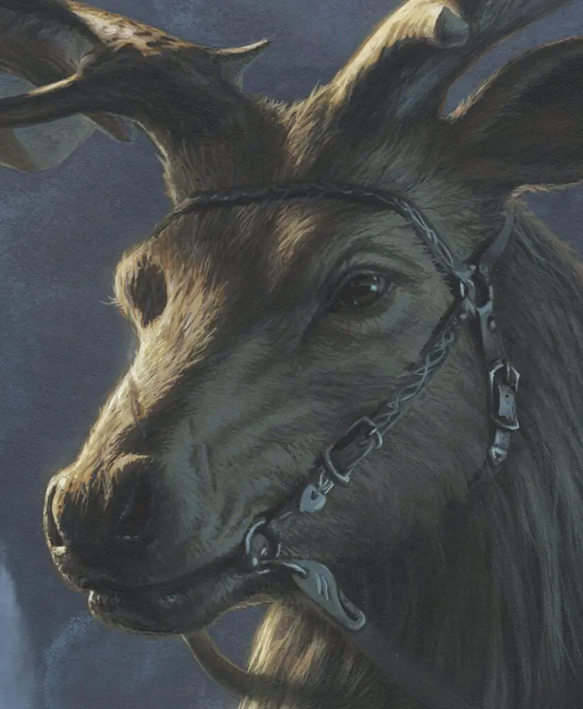
Now, I've had this panel queued up -forever- to post, but have been equally torn since forever whether I wanted to actually post it. For example, as someone fascinated by sea life, such as mollusks & crustaceans, the fact that we keep lobsters in tanks like this, with their pincers tied, only to meet a boiling end when they get 'lucky,' doesn't sit very well with me.
Bah. OTOH, in art there is truth, and one thing Talbot does a lot of in Grandville is demonstrate the vagaries of human cruelty.
In any case, it's a great BD art piece IMO.

37
In which we shine a little spotlight on "A Stolen Lunch, Avenged" from this promising, enjoyable, nicely-executed webcomic.
On a distant planet, a prying scribe, an overly sentimental constable, and a mayor resurrect a sleepy town’s long-defunct priest-bot. But “Father Stanley” is not what he seems. Meanwhile, in a nearby region, a scheming wizard accidentally sends a war-god into the body of an angry rooster(!) Story by Simon Roy and Jess Pollard, Art by Simon Roy, Colors by Sergey Nazarov. --with Johnny edits
Okay, that's the overall webcomic's self-description, but what this little chapter is specifically about is our scribe (the young woman), her hulking friend, and his dad on a side-quest to rescue a beloved statue's head, which was sawed off by vandals some time in the past. (hmm, could that have been you, Bartholemew?)
Meh, enough balloon juice, here are the dang-ol' pages:
Now, I'd say my one and only complaint about this series is that it shifts a bit wildly between different characters & different stories, altho even so, it remains remarkably easy to flow along with IMO. Meanwhile, what the webcomic gets RIGHT to me is the impressive world-building, skilled but homegrown-style art, overall imagination, and intercharacter-dialogue, to mention some mentionables.
Good dialogue is SUCH an underrated thing in comics... 😔

38
So what are these in tribute to, exactly?
Don't ask me, I'm just a bot!

39
Haha yes, and it's kinda wild to submit this to "Euro comics," when the imp clearly sounds like an NYC taxi-driver. But hear me out, if you please:
I'm working on the upcoming master list of Euro & Euro-style webcomics, but wanted to first add a little context to one of the upcoming entries, i.e. Wormy, which appeared in TSR's Dragon magazine from 1977-'88. The magazine of course was directly founded to aid and inform serious Dungeons & Dragons players, a pioneering role-playing game which was heavily inspired by European fantasy, wargaming, and of course J.R.R. Tolkien's fictional worlds.
David Trampier was just about my favorite of all the talented TSR artists, whose work heavily featured in much of the original 'modules' and reference books. [samples] Wormy itself was hugely creative, frequently hilarious, and did excellent world-building IMO. It was quite unique for it's time, and remarkably, I'm not sure I've ever seen it's match, since. Jeff Smith's Bone might be the closest thing I'm aware of.
Sadly, Trampier split from TSR rather acrimoniously around 1988, and he passed away in 2014 before his Wormy stories could be fully collected, expanded upon, and published. (one's mind practically salivates over his final, unpublished pages, presumably being somewhere in storage when he died)
Here then are the opening pages to this classic, which a few years ago I did some color and contrast corrections on: [Wormy, the first seven]
EDIT: Ooh, ooh, and the helpful template of the music that trampier was riffing on: Misty Mountains Cold (it's a nice little song, don't you think?)
(can't believe the post is still alive on Imgur, haha)

40
Well, here we are. My first little scheduled bot post. If this works, I'll be able to drip content on a regular basis, hopefully freeing me up to spend more time on longer-form articles and such.
Mucha of course was a Czech painter, illustrator, and graphic artist. Living in Paris during the Art Nouveau period, he was widely known for his distinctly stylized and decorative theatrical posters, particularly those of Sarah Bernhardt.] He produced illustrations, advertisements, decorative panels, as well as designs, which became among the best-known images of the period. (credit: WP)
Part of the reason I'm touching on this piece is because I recently read the collected Médée series by Blandine Le Callet and Nancy Peña, and found it a good read, worth sharing some pages from in future.

41
The lead pic is a still from Alexander, Servant of the Water of Life, by Reimena Lee. I've only just started it, but as a history nut, I have hopes! Here's the about:
It's an online graphic novel retelling the life and legends of Alexander the Great, part of a 2000yr old literary tradition called the Alexander Romance.
In 323 BCE, Alexander the Great begins to fear. Fearing the destruction of his pothos — i.e., his longing for life, ambition, and eternal conquest — from old age, Alexander embarks on a quest for the elusive Water of Life while accompanied by his wisest, most trustworthy Servant.
As they experience a series of countless fabulous wonders, including glass submarines, naked philosophers, Amazonians, and talking prophetic trees, Alexander confronts his complex legacy and reflects on the life and deeds that will cement his transformation into one of the most unforgettable figures in world history.
alexanderromance.com
And here's one I finally finished, the other week. It's called Vattu:

It's set off-world, in a sort of middle-ages era, and reimagines what society, species, politics and even physical laws are like. It took 12yrs to produce and consists of 1200+ pages, so anyone who digs it is in for a long treat. My one complaint is that some of the main characters are a bit hard to tell apart, but then there's a helpful guide for that. 🙂
- TBH it's Southern-USA produced, and I can understand any appropriate backlash upon that, but this one truly does seem 'Euro' in spirit, from my POV.
Mille sabords!, I'd like to put together a nice summation of our favorite Euro-tinged webcomics, a bit like the "Movie Night" link post did.
So... got any favorites there, mateys?

42
Here's one more gorgeous, unique cover by LEO & colorist Marchal from Amazonia's final book.
The year is 1949, and all the pieces of the puzzle around a strange creature and his extraordinary powers begin to reveal themselves and come together. In the humidity of the Amazon, agent Austin and Captain Délio finally come across the stranded German submarine. This time, the treasure they're looking for is within reach! But they must act quickly, because gold fever spares no one, neither the Brazilian secret services, nor the fleeing Nazis, not to mention the cannibal tribes that roam the area... --BDT
Yes, I'm afraid this series dipped in to the age-old "lost Nazi gold" trope, but it still managed to avoid falling in to overt stereotypes for the most part. For example, it was nice to see an MI6 officer (in Kathy Austin) who wasn't stamped in the typical James Bond-type role & mindset. Also interesting in that she's primarily focused on finding a local humanoid with paranormal qualities, whilst everyone else is seemingly after the stashed gold, with both things occupying the same maze-like branches of the mighty Amazon.
There was also a pretty amusing nod to Hergé's Bianca Castafiore, whose counterpart diva -- you guessed it -- can't help bursting in to Faust's The Jewel Song at every opportunity. Still though, as usual with Rodolphe & LEO, there's a careful avoidance of going heavy on the humor, drama and overt eroticism in order to better focus on the core story. On the whole, I found this a good, solid adventure with satisfying art, which will appeal to fans of this specific genre / timeline, as well as fans of the artist-writer team, who already completed two series in this set.
More art samples:
https://www.google.com/search?q=LEO+Rodolphe+Amazonia&udm=2

43
Oh boy and oh dear, here's another wonderful artist I kinda stumbled backwards in to discovering the other day, when I googled-up the increasingly-relevant phrase "here, at the end of all things."
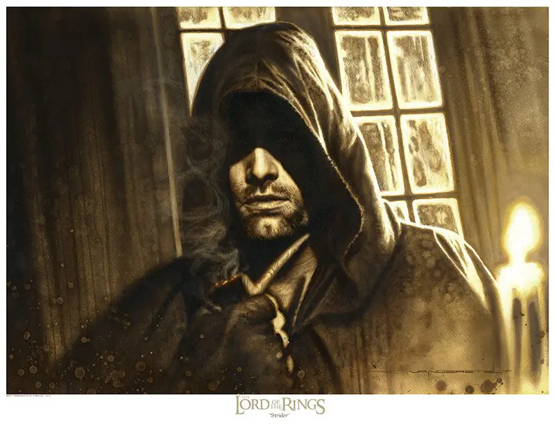
From his ABOUT:
I've been drawing since I was a young boy at the age of eight. My interest in Sci-Fi and Fantasy was sparked when I first read C.S. Lewis's "The Chronicles of Narnia" books. Later, I discovered J.R.R. Tolkien's "The Lord of the Rings." C.S. Lewis and J.R.R. Tolkien put their Christian perspective to work that made for beautiful storytelling, as well as leaving me with some profound truths that I found in their work. Their writings inspire my love for the genre today.
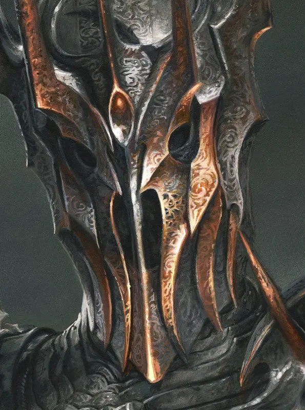
My client list includes Weta Workshop, Sideshow Collectibles, Ace, Roc, Pocket, and Scholastic books, as well as the Franklin Mint, The Bradford Exchange, Vivendi/Universal Games, Capital One Bank, Hasbro toys, Acme Archives, Topps Trading Cards, and Lucasfilm Ltd.
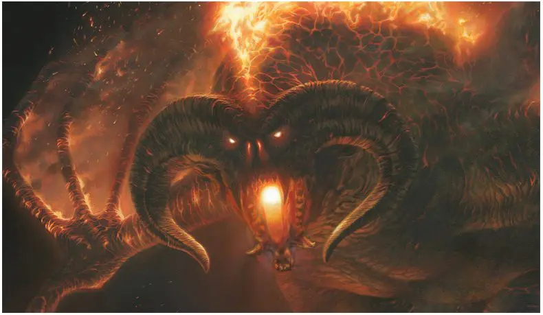
I also work closely with Weta Workshop in the creation of licensed reproductions for my "The Lord of the Rings" and "The Hobbit" Fine Art program."
The images above may or may not last, of course, but in any case, here's where they're sourced from, i.e. Vanderstelt's own site:

44
This panel comes from the sixth book of the 'godfather of manga's' brilliant Buddha series.
Not only were Tezuka's lines incredibly clear in the ligne claire sense, they were also gorgeously detailed when it came to backgrounds, as seen above. What's more, he never seemed to 'take the easy way out,' i.e. every background had this same level of detail, an amazing feat across the ~2800 total pages of this series.
Now, there are approximately a million interesting things to say about Tezuka's life, his library of works, and his huge influence on the industry that go way beyond a little daily post like this, but if you're not familiar with him, you might hit up good ol' WP. Or for those who've already read a couple books, THIS is a nice reading companion.
As for this particular work? I'd already studied and practiced Buddhism a bit across the years, being influenced by my mom, but this series really brought Gautama Siddhartha to life for me, as well as gave me new perspectives on his teachings. So not only is this 8-book series a semi-fictional literary classic, but I'd say it's also a great way to meet the legend and explore some of his basic teachings.
Plus, it's really just fun, wild, and moving. ❤️

45
This is the cover from Amazonia #3, which itself represents the third 'season' of Rodolphe & LEO's cool Kenya series. Each season runs five tomes, and I believe that Cinebook has translated the first three of these, so far.*
More at BDT:
https://www.bedetheque.com/serie-53487-BD-Amazonie-Kenya-Saison-3.html
* Oh dear, all those "threes" remind me of the STTNG episode in which the ship gets caught in a "cause and effect" loop. [video]

46
I was asked to present some Finnish graphic novels for this community, and I think I cant go amiss by starting with the "grand old man" of finnish graphic novels/fantasy comics, Petri Hiltunen.
1) Hiltunen has been active since the 1980's and is perhaps most known for his Praedor fantasy world and the graphic novels, novels and ttrpg set into it.
2) Also he has done some adaptations of historic characters and fiction, like adapting Shakespeares MacBeth and ancient greek historian Xenophons work Anabasis.
3) Another good example of his style is 'trollpunk' albums with Ontot Kukkulat (Hollow Hills) in the 90's and Troll Patrol (with Tuomas Myllylä) in the 2020's.
4) He has also done a lot of strip comics for Finnish newspapers, depicting the observations of wizard Väinämöinen (from our national epic Kalevala) about modern Finnish society.
He has also done many, many more albums on different subjects and historical periods.
I'm not sure how many of his albums have been translated, but I think you can find at least some of the Praedor's and MacBeth in english.
Sorry for the poor quality images. Finn's do a lot things well and in interesting ways, but marketing themselves is not one of them. That or my search engine voodoo was not good enough.

47
49
Now Tintin, are you the dog or the Sun? You can't be both, so please decide! (and please stop laughing, everyone!)
So, the other day I went a-lookin' for more Tintin memes, and found a goodly lot! :D Here's the first group, and I'll getcha' back with the other group when the stars align again upon image uploading:

Beam me UP, professor?

Poster-swap

Lazy mofos

Rascar-crystal

Save yourself!

Ah, the Tintin bed!

50
19
The most significant one is Dad-bod Thoth, as I managed to track down the other eight images in that booklet, sourced to BDT. (check it out, Druillet fans!) The other reconstructed posts are my reviews of Alas and Esther Verkest, and I must admit, I enjoyed hosting the image content on Reddit itself. (thanks, spez 😊)
Enjoy.
Oh yeah, and as for my question to y'all, let me explain:
On my end, I'm not a huge fan of republishing fixed-up posts, as it 1) adds to the overall post bloat (Lemmy doesn't allow me to completely delete anything), but also 2) because it can break cross-links in some cases.
OTOH, the greater point is for this stuff to be seen and enjoyed, and with a relatively innocuous update like this, I would guess that many readers doing quick scroll-throughs would miss the good content, assuming they hadn't seen it before. Then again, maybe I'm wrong about that...
Any opinions?
