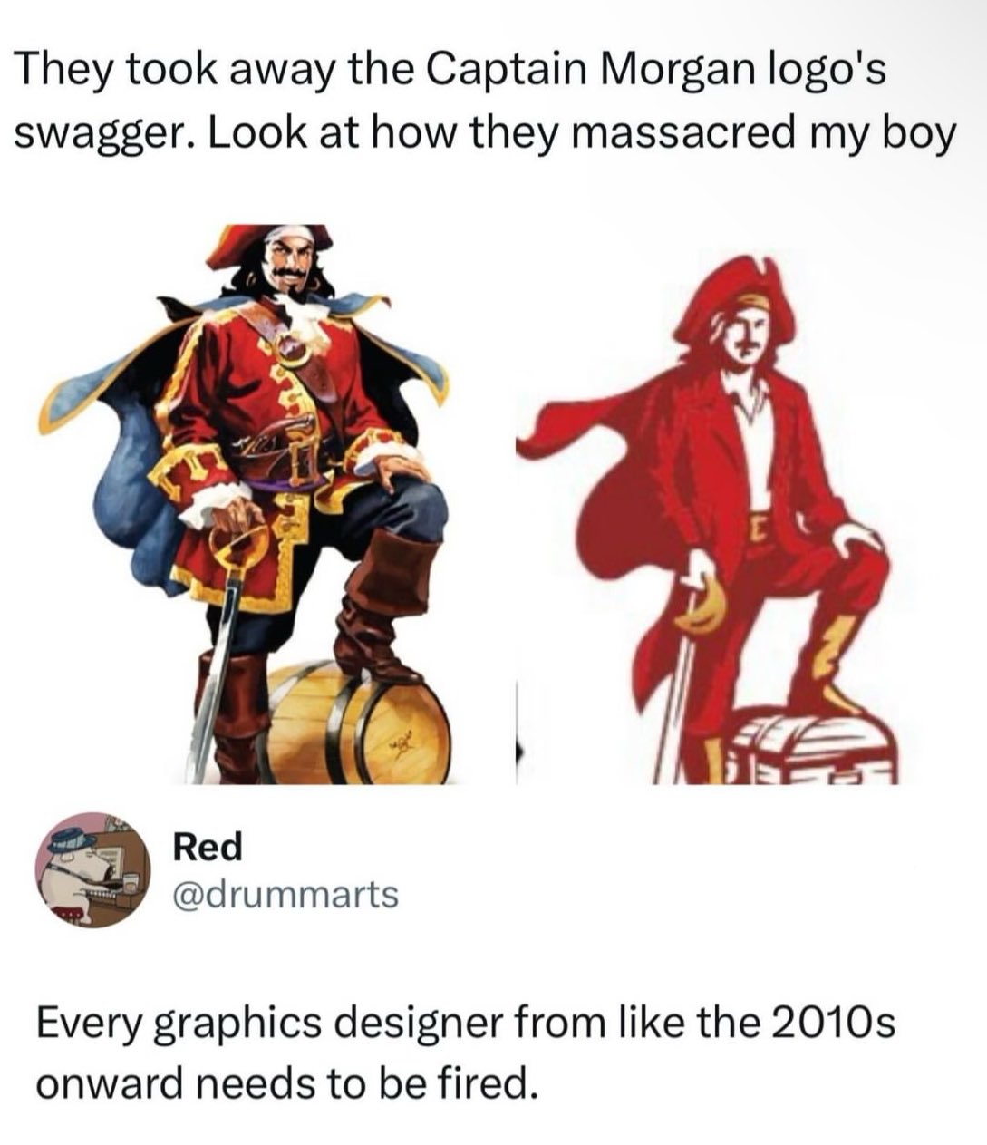
He does not 'got a little Captain in him.'
People tweeting stuff. We allow tweets from anyone.
RULES:
He does not 'got a little Captain in him.'
This can't be real, it's so bad. Is the sword just clipped to his hand?
Redrum. RedRUM. REDRUM.
When you loose access to your 1000+ hour account and have to start over.
Don't worry they probably will be fired soon anyway
They were probably fired before this was even degisned. I bet this is just AI generated crap that they thought was cool.
Joel Haver vibes.
Theory: they wanted to reduce label printing costs by reducing the color palette to three distinct colors... Still could have done a better job with the logo, though.
"Business casual" is really getting out of hand.
Why did they turn him into the Tampa Bay Mascot Bucco Bruce?
i have no idea what this brand is supposed to be but...
tbh i don't see anything wrong with the right one
logos are supposed to be simple-ish, use minimal amount of colors and be scalable and it sure does a better job with it's reduced color palette and vector shapes
the one on the left should be reserved for e.g. illustrations
I kinda agree with it from an ease of printing perspective and easy perception from a distance, but they completely changed the proportions and got rid of the contrasting dark blue/red color-scheme that would catch people's eyes. Looking at them side by side I'm still not convinced they're even the same company, and that's a failure for brand recognition in my mind which is the only reason logos even exist.
This is why I prefer Admiral Nelson's rum.
Also because it's quite a bit cheaper.
Definitely a lower quality rum though.
Kraken if you want something a little better, or Sailor Jerry if you're looking for something comparable in quality.
Though none of them are what I would call "premium"
It's probably part of an ongoing trend. There's been sort of a renewed interest in legacy branding in some parts of the brewing world. I would say Miller kind of kicked it off 10 years ago when they rebranded Miller Lite using an updated version of their 1973 can. It was very successful. I actually did a marketing study on it for a project at work around that time.
Since then, several old beer brands have been resurrected. Hamm's, Heileman's Old Style, PBR, just to name a few. If you start seeing Fallstaff at your local liquor store, you'll know we've come full circle.
From Assassin’s Creed: Black Flag to Pringles
Could have been worse - if they'd decided to redesign him in the 90s he would have just been a series of interlocking ovals, which was the style at the time.

I plan to play my preview of Ironsworn: Sundered Isles this weekend and you bet your ass that the OG Captain Morgan graphic is going to be one of the NPCs at some point.
Good NPC (mentor?) or boss fight?
Rum is horrible anyway. Who cares. But yeah, terrible new mascot. The cosplay comments are spot on.
Edit: you want a gawdawful hangover? Rum is your copilot.
As little a hangover as possible? Straight vodka.
Sipping a complex drink with thousands of years of history? Proper single malt whisky from Scotland.
Checking the important things - Sailor Jerry looks like it's still the same. Can't tell if the pinup girl is still on the inside of the label though.