this post was submitted on 20 Jan 2025
53 points (100.0% liked)
Formula 1
10017 readers
172 users here now
Welcome to Formula1 @ lemmy.world Lemmy's largest community for Formula 1 and related racing series
📆 F1 Calendar
🏁 FIA Documents
📊 F1 Pace
2025 Calendar
| Location | Date |
|---|---|
| 🇪🇸 Spain | 30 May-01 Jun |
| 🇨🇦 Canada | 13-15 Jun |
| 🇦🇹 Austria | 27-29 Jun |
| 🇬🇧 Great Britain | 04-06 Jul |
| 🇧🇪 Belgium | 25-27 Jul |
| 🇭🇺 Hungary | 01-03 Aug |
| 🇳🇱 Netherlands | 29-31 Aug |
| 🇮🇹 Italy | 05-07 Sep |
| 🇦🇿 Azerbaijan | 19-21 Sep |
| 🇸🇬 Singapore | 03-05 Oct |
| 🇺🇸 United States | 17-19 Oct |
| 🇲🇽 Mexico | 24-26 Oct |
| 🇧🇷 Brazil | 07-09 Nov |
| 🇺🇸 United States | 20-22 Nov |
| 🇶🇦 Qatar | 28-30 Nov |
| 🇦🇪 Abu Dhabi | 05-07 Dec |
Rules
- Be respectful to everyone: drivers, lemmings etc
- No gambling, crypto or NFTs
- Spoilers are allowed
- Non English articles should include a translation in the comments by deepl.com or similar
- Paywalled articles should include at least a brief summary in the comments, the wording of the article should not be altered
- Social media posts should be posted as screenshots with a link for those who want to view it
- Memes are allowed on Monday only as we all do like a laugh or 2, but don’t want to become formuladank.
- No duplicate posts, or posts of different news companies that say the same thing.
founded 2 years ago
MODERATORS
you are viewing a single comment's thread
view the rest of the comments
view the rest of the comments
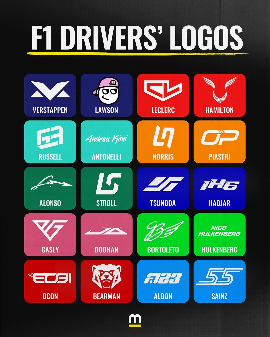
Gonna be honest, I don't like most of these. Half of them look like low budget RGB Gamer Headset brands or eSports brands to me.
They don't really remind me of racing, besides Carlos', which I like. Retro styling, two white lines on the sides just like a track, italic to give a sense of speed and forward movement. A good logo that reminds me of motorsport. If you put that logo on an F1 car from almost any era, it wouldn't look out of place.
I also like Lando's because the use of negative space is pretty cool.
Lewis' is, I guess, classy. It's subtle and it integrates well into helmet designs. Wings and the face of a panther. The problem is I only recognised it as such once it was pointed out to me, so I'm either stupid (and I won't rule that out) or it's a little too subtle.
Bortoleto's I like, although it kinda looks like they took Bentley's logo and changed it enough to not cause legal issues lol