this post was submitted on 07 Apr 2024
62 points (100.0% liked)
Don't Dead - Open Inside
1357 readers
248 users here now
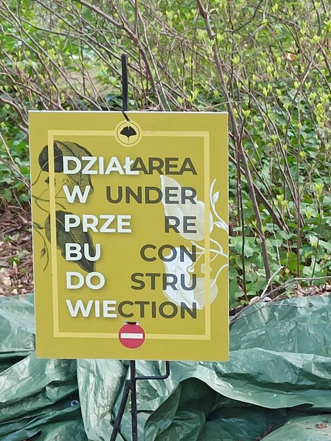
Images of text-designs, that are barely readable due to the placement of the words or letters
Please indicate which post is original by writing "OC" and properly credit stolen posts.
Please mark NSFW posts properly, don't spam, yadadadada
founded 2 years ago
MODERATORS
you are viewing a single comment's thread
view the rest of the comments
view the rest of the comments
I'd say, they did a good job separating phrases by colour and the Idea isn't too bad. But I can't stop seeing "Diar(rh)ea wunder" in the first two lines