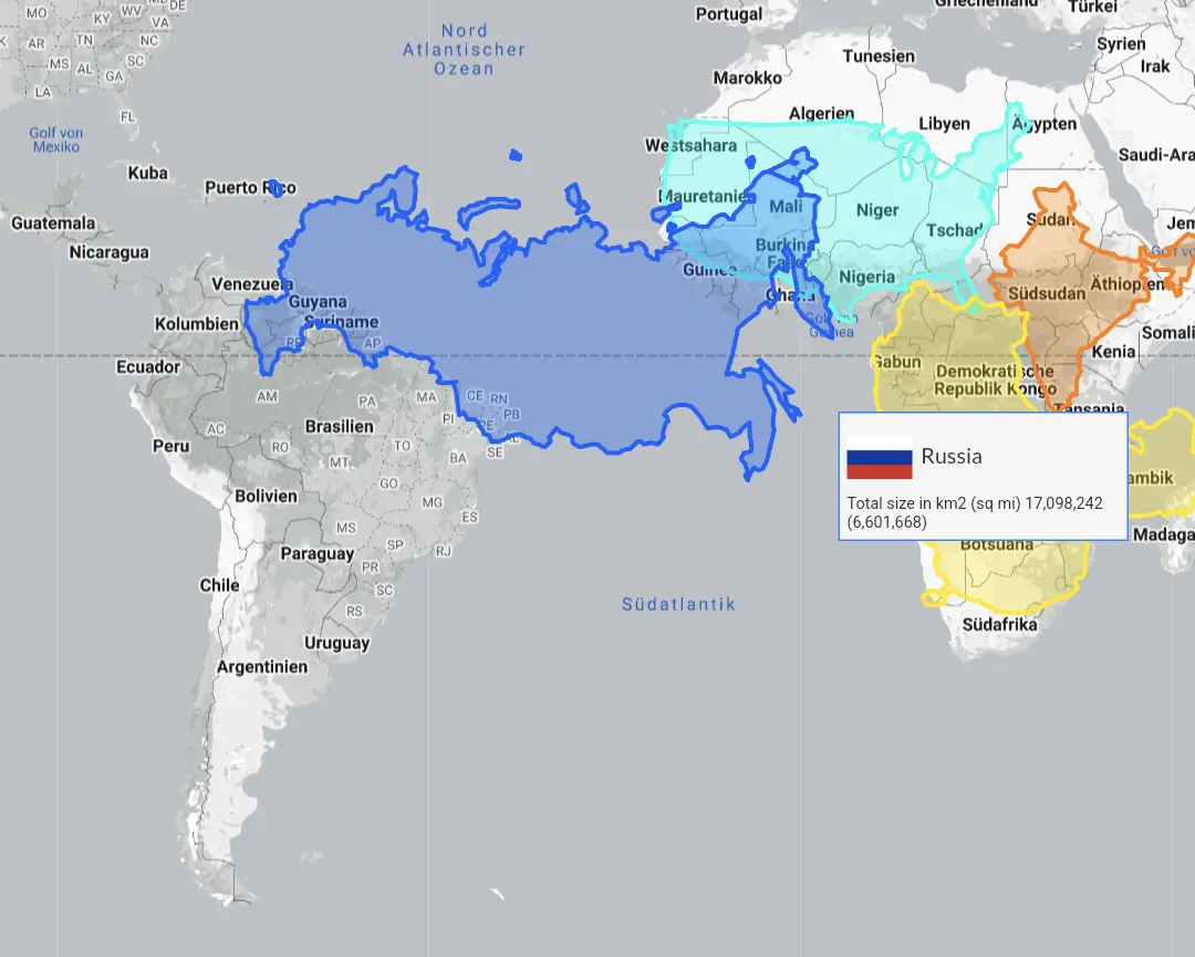
Russia looks Mercator'd. Would be better if they' picked a projection to get a truer shape of Russia to overlay.
this post was submitted on 20 May 2024
124 points (100.0% liked)
Cool Guides
5606 readers
6 users here now
Rules for Posting Guides on Our Community
1. Defining a Guide Guides are comprehensive reference materials, how-tos, or comparison tables. A guide must be well-organized both in content and layout. Information should be easily accessible without unnecessary navigation. Guides can include flowcharts, step-by-step instructions, or visual references that compare different elements side by side.
2. Infographic Guidelines Infographics are permitted if they are educational and informative. They should aim to convey complex information visually and clearly. However, infographics that primarily serve as visual essays without structured guidance will be subject to removal.
3. Grey Area Moderators may use discretion when deciding to remove posts. If in doubt, message us or use downvotes for content you find inappropriate.
4. Source Attribution If you know the original source of a guide, share it in the comments to credit the creators.
5. Diverse Content To keep our community engaging, avoid saturating the feed with similar topics. Excessive posts on a single topic may be moderated to maintain diversity.
6. Verify in Comments Always check the comments for additional insights or corrections. Moderators rely on community expertise for accuracy.
Community Guidelines
-
Direct Image Links Only Only direct links to .png, .jpg, and .jpeg image formats are permitted.
-
Educational Infographics Only Infographics must aim to educate and inform with structured content. Purely narrative or non-informative infographics may be removed.
-
Serious Guides Only Nonserious or comedy-based guides will be removed.
-
No Harmful Content Guides promoting dangerous or harmful activities/materials will be removed. This includes content intended to cause harm to others.
By following these rules, we can maintain a diverse and informative community. If you have any questions or concerns, feel free to reach out to the moderators. Thank you for contributing responsibly!
founded 2 years ago
MODERATORS
Comparing a continent against countries...
How is this supposed to be informative?
Was going to say the same thing. How’s north America compare.
Right? This isn’t a good one
It's of course totally accidental that the Mercator projection was chosen for the world map, that makes Africa look much smaller compared to other countries.
I thought it was because of its use in with constant straight lines and angles could be used for travel
In talking about the world map specifically. Nobody would use that for plotting a course.
I can only go by what these articles claim---that that projection is used for plotting/planning. https://www.britannica.com/science/Mercator-projection
30Mm^2^ is dam large.
Canada?