22
[UserScript] Lemmy_monkey - a full restyle in the spirit of old.reddit - updated for Lemmy v0.18
(greasyfork.org)
Just an FYI post for folks who are new or recently returning to Lemmy, I have updated the linked grease/tamper/violentmonkey script for Lemmvy v0.18.
These two scripts (a compact version and a large thumbnail version) substantially rearrange the default Lemmy format.
These are (finally) relatively stable for desktop/widescreen. Future versions will focus a little more on the mobile/handheld experience.
These are theme agnostic and should work with darkly and litely (and variants) themes.
- Greasyfork here: https://greasyfork.org/en/users/1107499-mershed-perderders
- Github here: https://github.com/soundjester/lemmy_monkey
- If you need the userscript for Lemmy v0.17.4, that can be found here:
- https://github.com/soundjester/lemmy_monkey/tree/dev-v1.11-Lemmy-v0.17
- this v0.17.4 userscript is no longer in active development
- If you need the userscript for Lemmy v0.17.4, that can be found here:
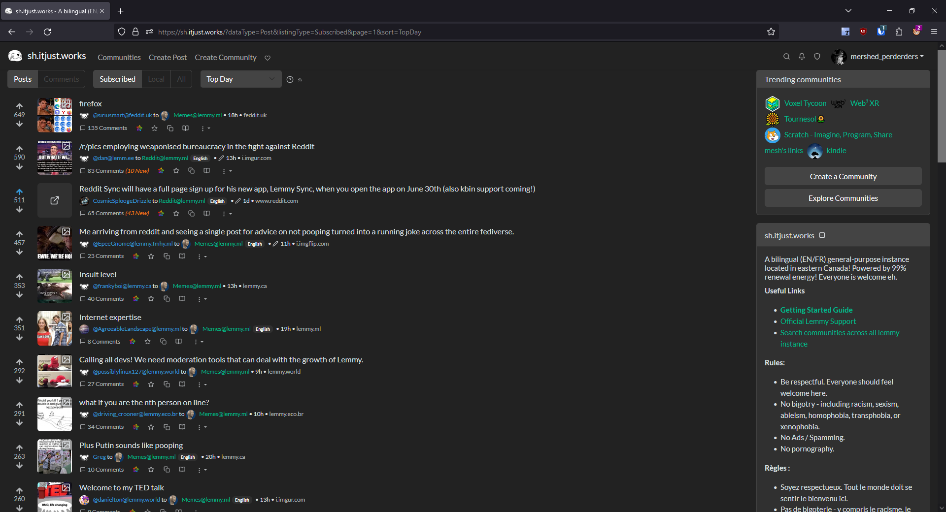
Screenshot of "Compact" version
main page
 -
-
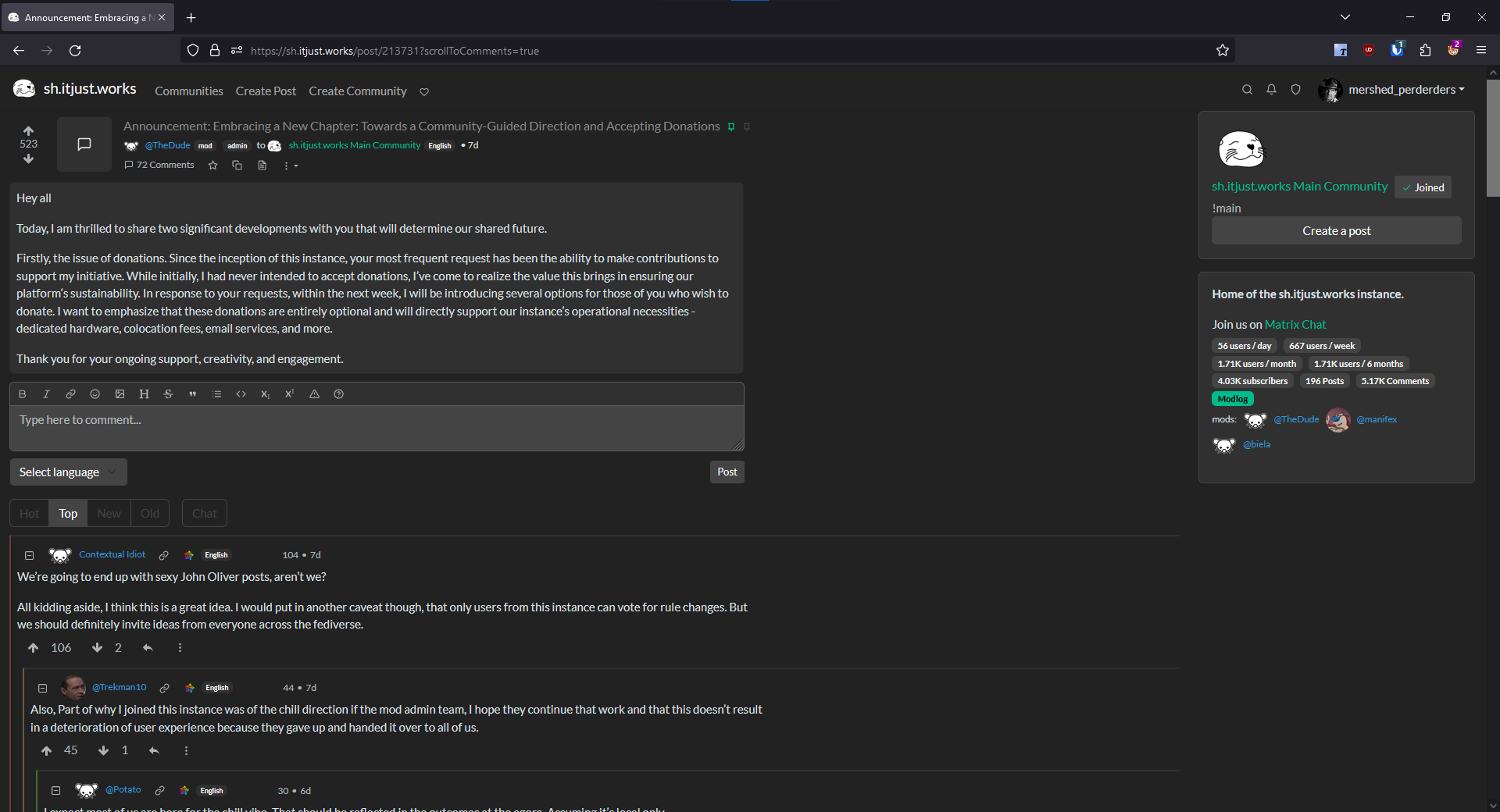
comments page
As always, feedback is appreciated!