Okay, worst illustrations... I'm still annoyed by how bad this illustration was in Ascendance of a Bookworm.

Style-wise, there's nothing wrong with it. The rendering is fine and the proportions are all right. What I dislike is how... AWKWARD it is. And not in a "oh, Myne's feeling awkward" but more like just how awkwardly it's drawn. Myne's breaking the fourth wall and staring at the reader. Lutz is behind her instead of on the other side of the pot where he would normally be if he was, you know, actually helping. This is clearly a case of the artist just drawing something as described rather than trying to capture a moment of the story in time.
Compare that to Llo, who I think EXCELS at capturing story moments in time.


There's so much movement in a still picture. It's so dynamic you almost feel like you're there watching it yourself. And even in slower moments there's incredible amounts of emotion.


Llo's use of the split-screen is fantastic. It allows you to get multiple perspectives in a single image without it ever feeling forced or awkward. Just, absolute next level stuff.
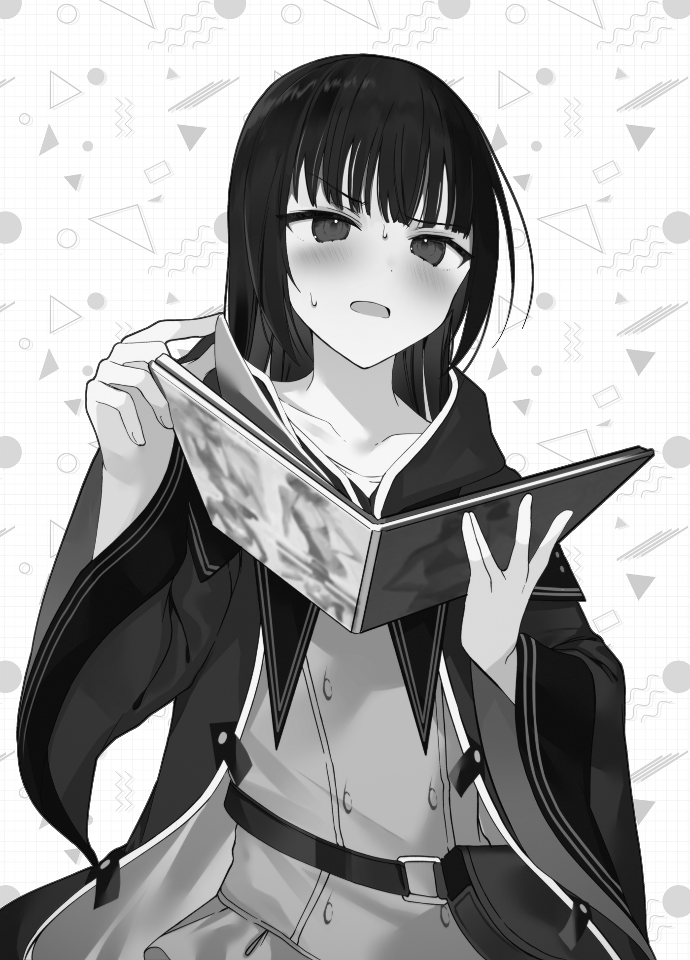
I'd also like to talk about KWKM. Their art is fantastically detailed with very unique embelishments that I don't normally see in fantasy-style art.

I used this photo before when we were promoting our pics for the 2024 awards but I want to bring it up again. It's just so detailed with amazing highlighting and tone. Frequently an artist who is good at B&W fails to adequately do color well but that's not the case with KWKM. Their art is so detailed and just breathtaking. Speaking of B&W art, they also shine there as well.

Just all-around great art. Although it's very clear that their strength is in drawing people since very little of their art depicts scenery. Here's another good color spread:

Anyway, those are all pretty big publications with A-tier artists so I'd also like to talk about some more indie novels. One of my favorite indie LNs is The False Hero and the author uses art from a variety of sources. The main artist who does the covers is actually pretty good. Sure, it's not Llo amazing, but I'd say it's better than 95% of the art in other indie novels.


The issue is that Unholysoul27 doesn't do all the art in the book. My guess is their commission prices are higher than others so they're reserved for covers and the best color inserts. But seriously, that second piece of art... amazing. There's a lot going on in the story at that moment and it depicts it so subtly that I STILL think about that piece of art long after I've finished reading the book.
BUUUUUT then there are other artists that contribute to the book and their styles don't always mesh with Unholysoul27. Take this for instance:

She looks absolutely derpy and nothing like the character depicted in the text (who is a sulty tsundere vampire). For reference: this is the same character:

and this:

And it doesn't get any better from there. These next images all depict the same character:


Now you might be thinking "well, it's definitely a mis-match of styles but overall the quality is pretty good." But then they throw in some low-tier art like this:

You might notice that every image I've linked as been in color. And that's because every image in the novels IS in color! That's one thing I actually do enjoy. Like I said, this is still one of my favorite LNs, and probably my favorite from an indie author.
Now for some really pathetic art. Lets talk about The Anime Trope System. This is trash LN at its finest. The author basically decided to parody every trope from Japanese LNs and put it in one series and it's actually pretty hilarious. You have OP characters. You have stupid amounts of power creep. You have children's card games. You have a MASSIVE harem of like 20+ girls (all but 1 who were virgins before meeting the MC) that doesn't feel stupidly awkward and doesn't devolve into orgies and all the people fighting for sexy time. Seriously, it's one of the best written harems I've seen... and it's a PARODY! Anyway, this isn't about the story but the art. The books don't really have any art outside of the covers but the author decided to change artists mid-way through the series and OMG did the cover art get so much worse.
Here's the art for the first couple novels. Each basically depicts a new character being introduced (who inevitably becomes part of the harem)


It's cute and it does a VERY good job at showing us what these characters look like.
Then the artist changes and we get... whatever this is:


Then afterwards it becomes a rollercoaster as each cover is done by a different artist. Sometimes they're good, sometimes they're awful. Here's a better one.

A similar thing happens with Rise of the Weakest Summoner except the juxtapositionis SO much worse. At least with Anime Trope System they're all in an anime style. Not so here. This is the cover of book 1:

This is the EXACT SAME CHARCTER on the cover of book 7

Anyway... I've droned on long enough. Enjoy the art.