this post was submitted on 23 Mar 2025
38 points (100.0% liked)

Data is Beautiful

1716 readers
2 users here now

Be respectful

founded 9 months ago
MODERATORS
 

Some real beautiful data graphs in this paper

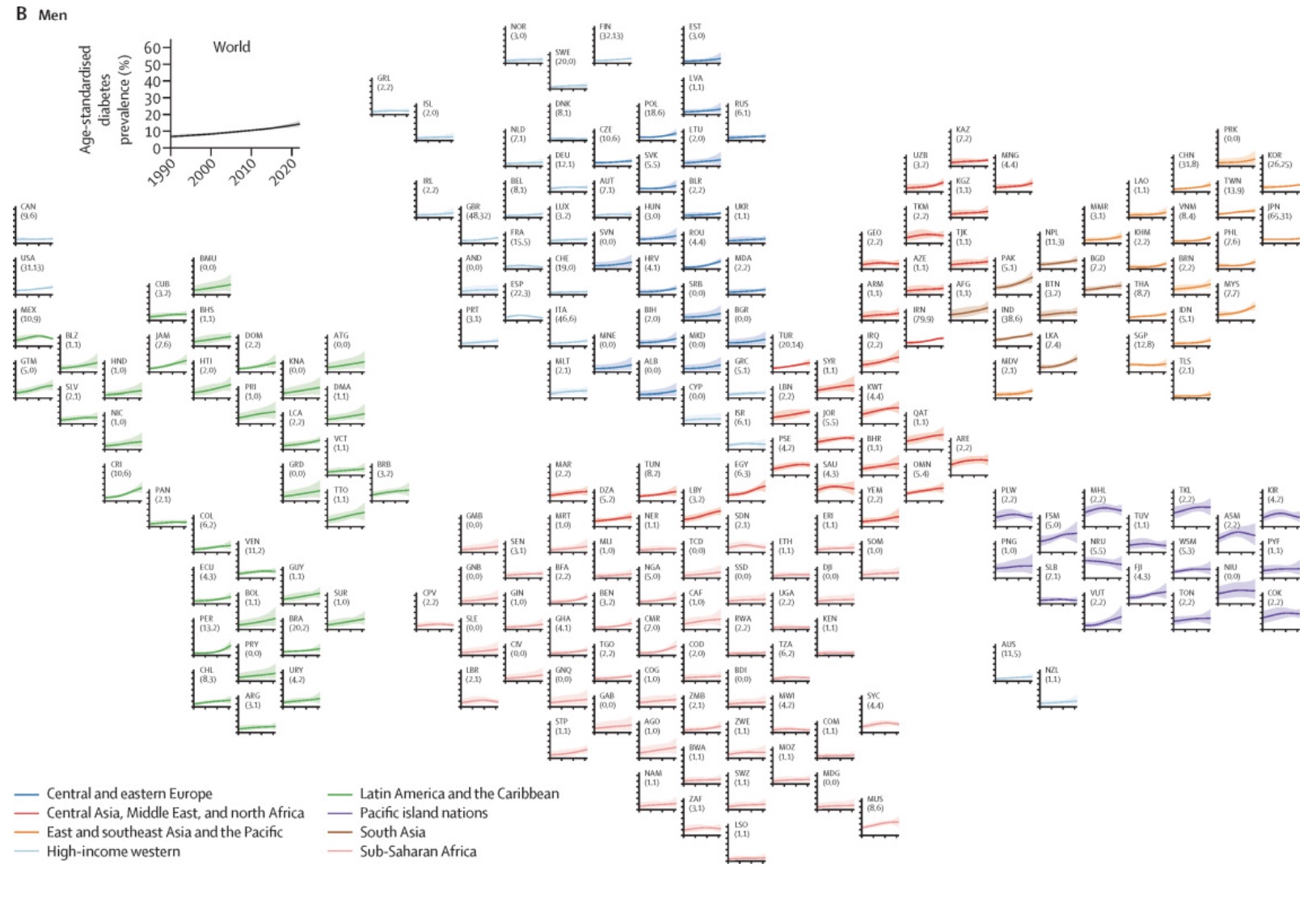
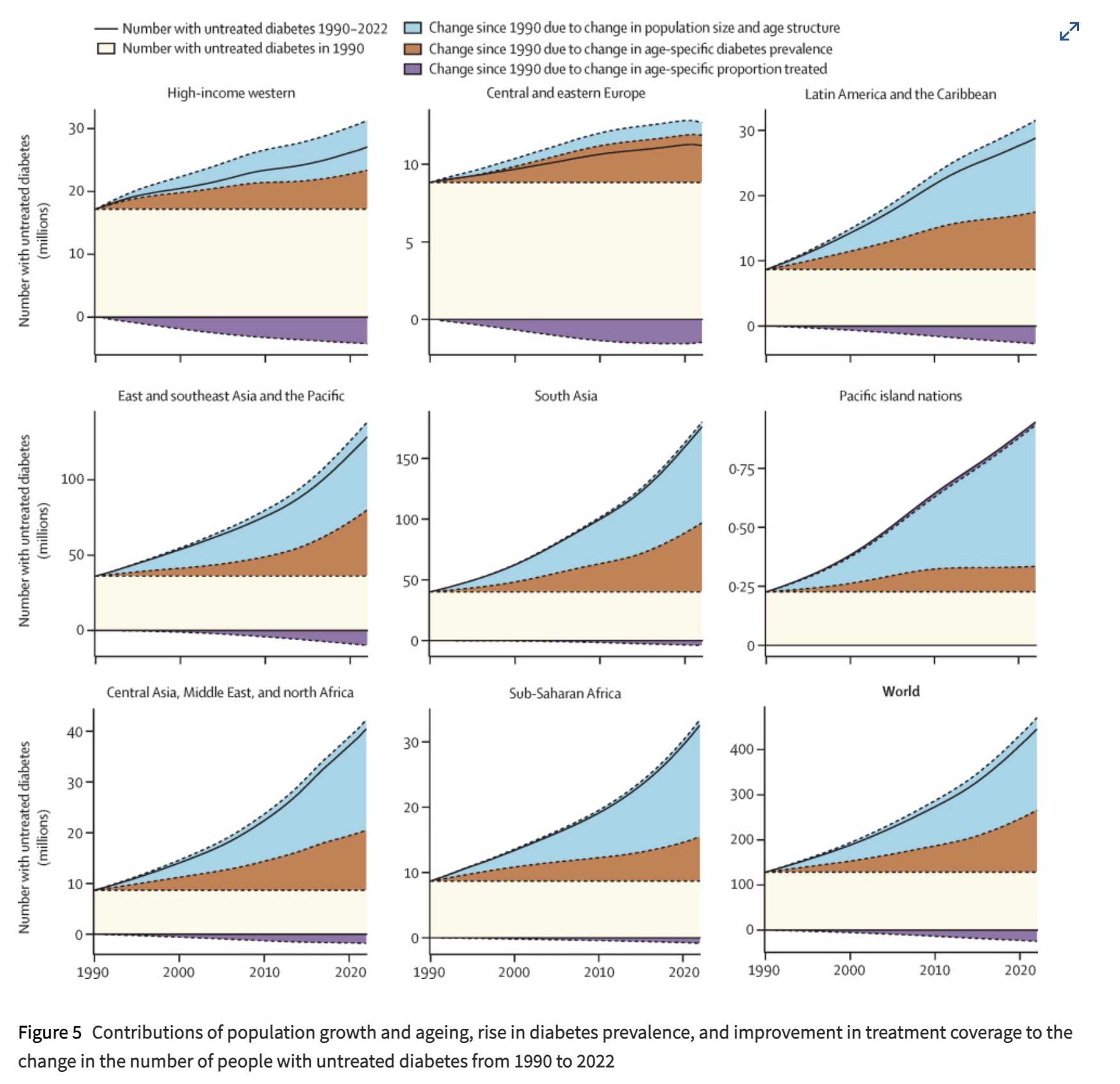
Source: https://doi.org/10.1016/S0140-6736(24)02317-1

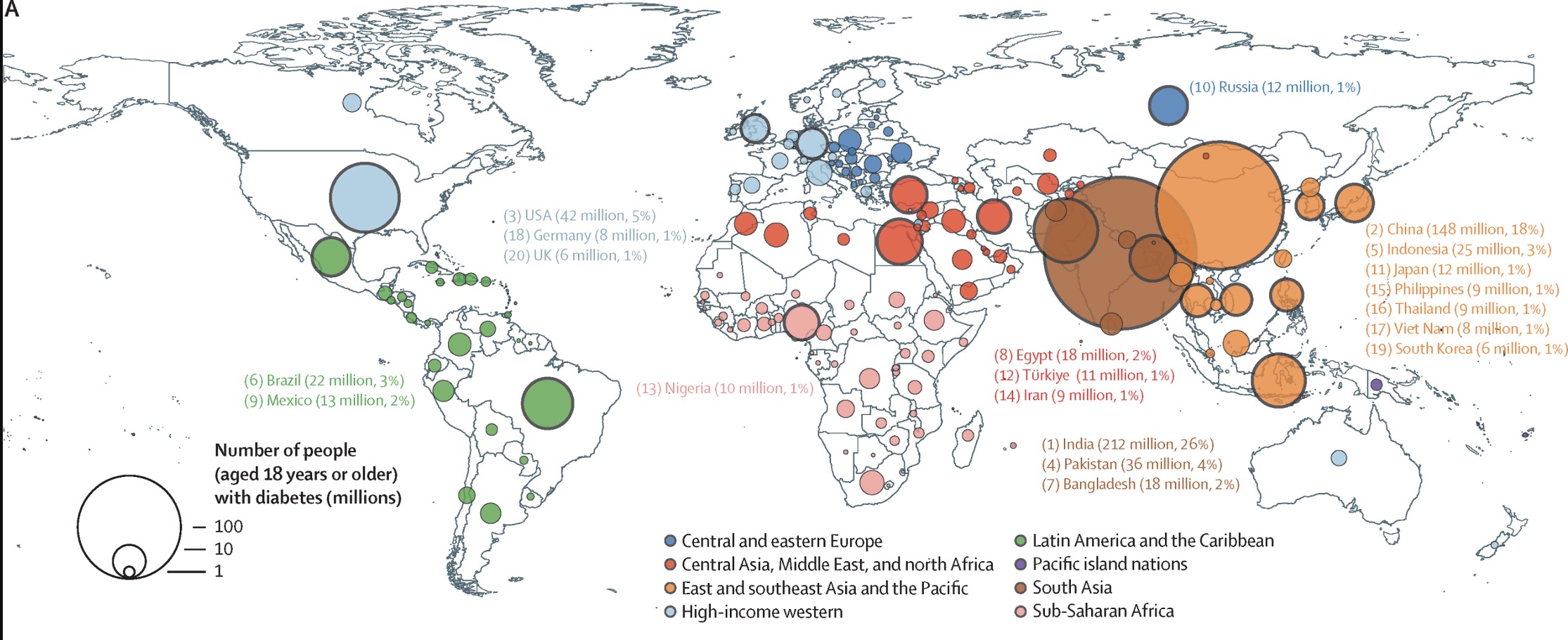
The Top 4 Countries by rate:

  1. India 26%
  2. China 18%
  3. USA 5%
  4. Pakistan 4%

This is only accounting for tracked diabetes, so some of the areas might have larger numbers.

top 10 comments
sorted by: hot top controversial new old
[–] Apytele@sh.itjust.works 6 points 1 week ago* (last edited 1 week ago) (1 children)

I forget where I heard that the only people the CCP bow to are Coca-Cola. It's shocking how much of the world they basically own.

[–] jet@hackertalks.com 6 points 1 week ago* (last edited 1 week ago) (1 children)
[–] BlueEther@no.lastname.nz 6 points 1 week ago (1 children)

A bit hard to draw anything from that graphic other than raw consumption. Realy needs to be per capita

[–] angrystego@lemmy.world 3 points 1 week ago (1 children)

So what the hell is going on in India and China? 26 % and 18% are huge numbers compared to the usual 1% in the rest of the world.

[–] jet@hackertalks.com 2 points 1 week ago* (last edited 1 week ago) (1 children)

Yeah, that is a puzzle.

India does have a very large vegetarian population, which means they have a high carb diet, which is a necessary component of T2D.

That doesn't explain China, china is the puzzle. I've seen a theory that the only major dietary change in China is the proliferation of industrial cooking oils which does increase insulin resistance in mice.

[–] angrystego@lemmy.world 3 points 1 week ago (1 children)

Yeah, it's around a fifth of the population. There must be something seriously wrong there. Like something not found anywhere else but widespread in those countries.

[–] jet@hackertalks.com 3 points 1 week ago* (last edited 1 week ago)

Europeans tend to have hyperplasic fat, and Asian tend to have hypertrophic fat. Meaning a European can get much fatter then a asian before the REALLY BAD THINGS start to happen. That might be a variable

[–] tburkhol@lemmy.world 2 points 1 week ago (1 children)

It's a shame these graphs - all the graphs in the paper - report number of people and not rate. Makes it yet another population map, although the exponential growth of untreated diabetes in Americas and Asia is a pretty stark contrast to Europe, even without normalization.

[–] jet@hackertalks.com 1 points 1 week ago* (last edited 1 week ago)