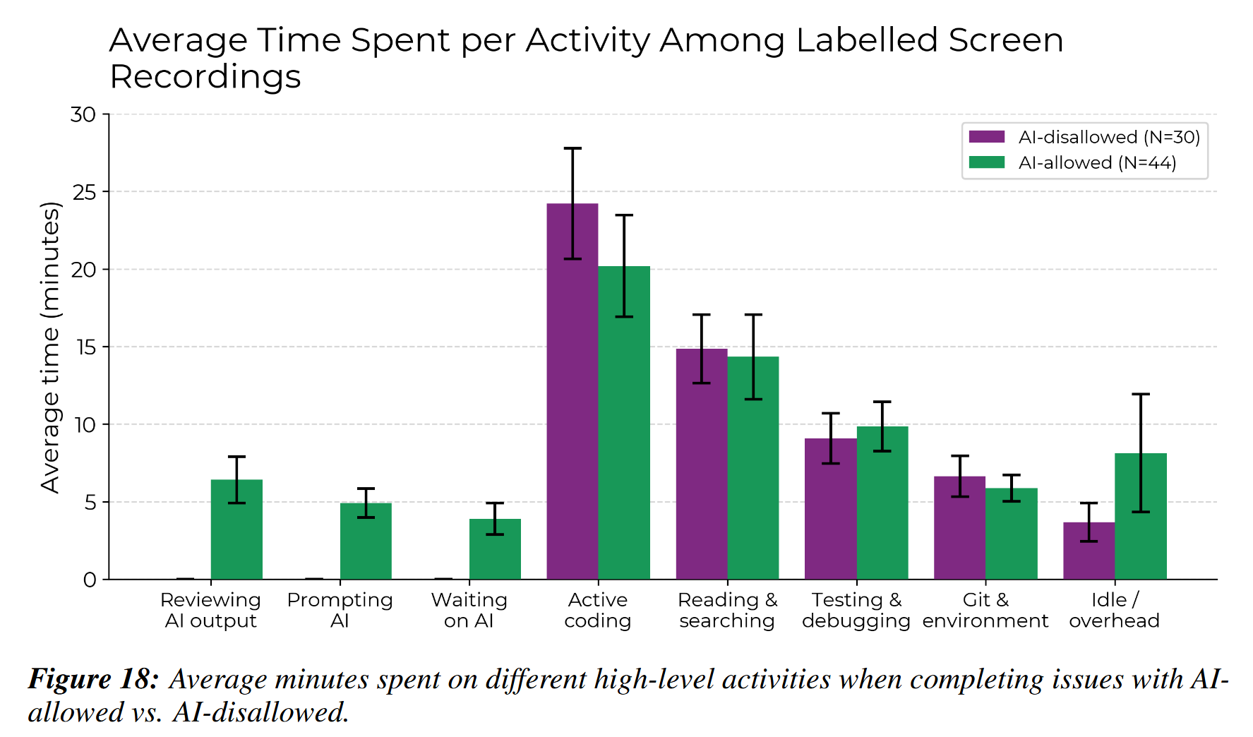
Yeah, I had to dig a bit further for this figure. They display the same data more prominently in percentage of the time devoted to each bug, which gives them smaller error bars, but also doesn't really answer the question that matters regarding where the time went.
Worth noting that this is a subset of the data, apparently. They recorded about a third of the bug fixes on video and cut out runs with cheating and other suspicious activity. Assuming each recording contains one bug they end up with a fourth of the data broken down this way.
Which is great, but... it does make you wonder why that data is good enough for the overall over/underestimate plot if it's not good enough for the task breakdown. Some of the stuff they're filtering out is outright not following the instructions or self-reporting times that are more than 20% off from what the recording shows. So we know some of those runs are so far off they didn't get counted for this, but presumably the rest of the data that just had no video would be even worse, since the timings are self-reported and they paid them to participate by the hour.
I'd definitely like to see this with more data, this is only 16 people, even if they are counting several hundred bugs. Better methodology, too. And I'd like to see other coder profiles in there. For now they are showing a very large discrepancy between estimate and results and at least this chart gives you some qualitative understanding of how that happened. I learned something from reading it. Plus, hey, it's not like AI research is a haven of clean, strict data.
Of course most people will just parrot the headline, because that's the world we live in.
Wait, who wins between scissors and wax tablet? Does that count as stone?