Data Is Beautiful

4 readers
1 users here now

A place to share and discuss data visualizations. #dataviz
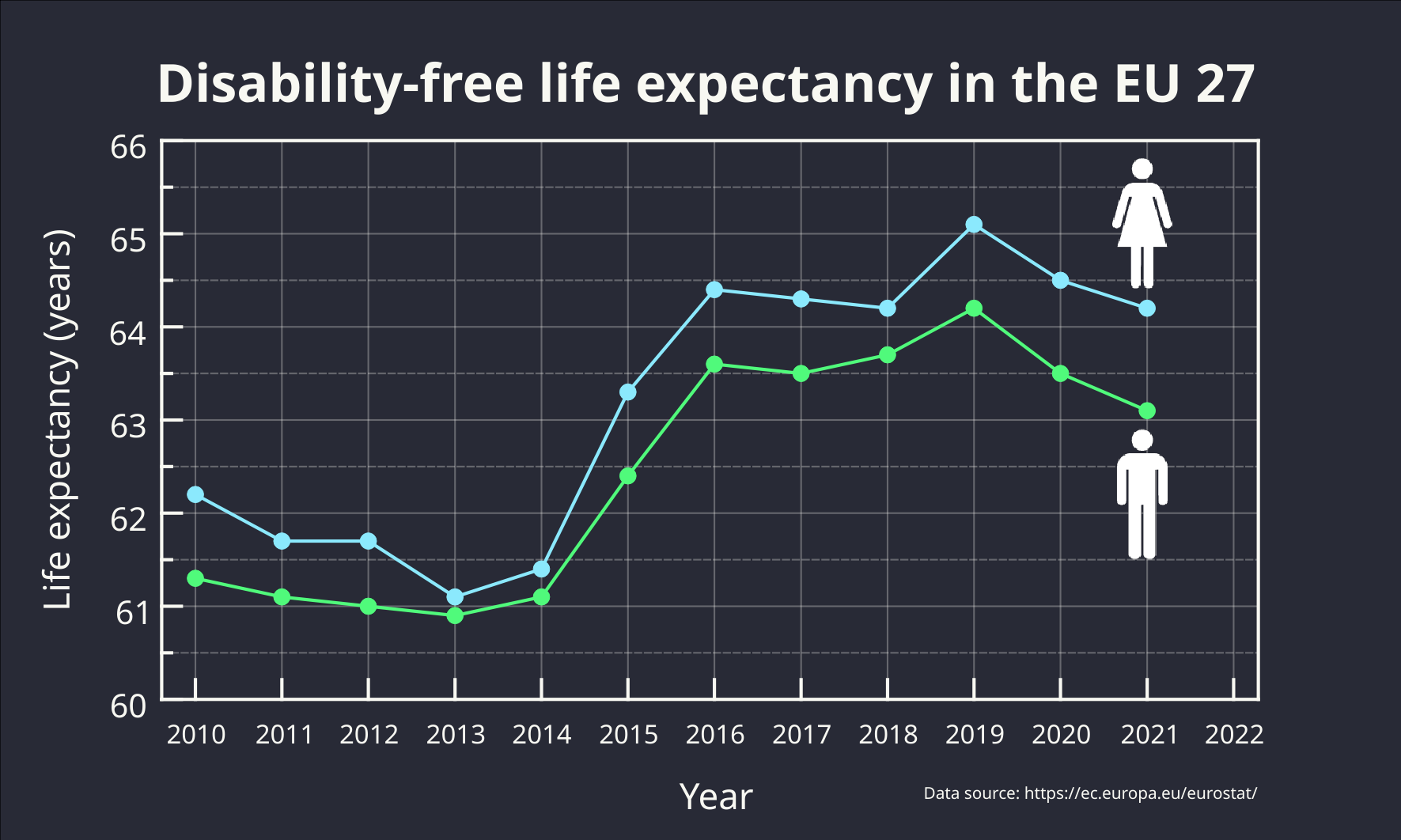
founded 4 years ago
MODERATORS
1
 
 
2
 
 
3
4
1
submitted 1 year ago* (last edited 1 year ago) by [email protected] to c/[email protected]
5
6
7
1
Wine and Cheese Map (www.wineandcheesemap.com)
submitted 1 year ago* (last edited 1 year ago) by [email protected] to c/[email protected]
8


Red indicates a higher average temperature than the previous year; blue the opposite.

source

9
 
 
10
1
submitted 1 year ago* (last edited 1 year ago) by [email protected] to c/[email protected]
11
 
 
12
 
 
13


You can read the report here

14
15
16
 
 
17


It is certainly not perfect, but still an impressive piece of work.

I found it here.

And here is a version embedded in a web page so it scales to your browser window's width.

18
19
 
 
20
 
 
21
 
 
22
 
 
23
 
 
24
25
 
 
view more: next ›