Data is Beautiful

1838 readers
18 users here now

Be respectful

founded 10 months ago
MODERATORS
1
38
submitted 6 months ago* (last edited 6 months ago) by [email protected] to c/[email protected]


Hello everyone,

I am at the moment the only active mod of this community, which is usually not recommended.

I am hence looking for other mods. The moderation load is very low, people on this community are usually nice.

Please comment with a mander.xyz account (reports do not federate) below if you want to become a mod.

2
3
4
5
6
217
How the Brain Works (lemmynsfw.com)
submitted 2 weeks ago* (last edited 2 weeks ago) by [email protected] to c/[email protected]
7
8
9
10


About page: https://www.rawgraphs.io/about

Tutorials: https://www.rawgraphs.io/learning

Many visual models have been conceived and identified in the past several years, but their production is difficult for non-technical users and coding knowledge and a significant amount of time is still required to master the libraries and the tools that allow to create them.

What makes RAWGraphs different from other data visualization tools?

  1. No fee and no registration required. RAWGraphs is open and free for everybody

[...]

  1. RAWGraphs doesn’t store data.

Even though RAWGraphs is a web app, the data you insert will be processed only by the web browser. No server-side operations or storages are performed, no one will see, touch or copy your data.

  1. Open outputs optimized for your design process.

RAWGraphs allows you to export your visualizations in .svg. [...]

I learned about it from this article: https://gijn.org/stories/four-free-cutting-edge-investigative-data-tools/

In particular, it was described as follows:

While excellent visualization tools such as DataWrapper and Flourish are frequently used in published investigations, reporters often need simple, fast graphical depictions of their data during the reporting process. In addition to guiding your understanding of complex data as you gather it, it’s often helpful to have a simple bar chart, matrix plot, or bubble chart to show your editor or a potential source.

Pooja Dantewadia, data journalist at Realtor.com and a former graphics reporter at The Los Angeles Times, said the open source RAWGraphs web app is not only ideal for briefings and brainstorms, but is also useful for rapid chart choices and published graphics on deadline.

RAWGraphs “is amazing in terms of quickly turning data into visuals,” Dantewadia noted. “It’s great if you want quick analysis of data, and to quickly see what kind of chart would be most appropriate, so your editor can quickly see what the data is showing. It’s great for brainstorming. And you don’t even have to sign up — that’s how quick it is.”

The app includes 30 chart models, from Sankey diagrams to heatmaps, and its Youtube channel offers helpful tutorials on how to build and export each one. According to the website, data you upload to the tool should be secure because “the data you insert will be processed only by your web browser.”

11
38
submitted 1 month ago* (last edited 1 month ago) by [email protected] to c/[email protected]


Some real beautiful data graphs in this paper

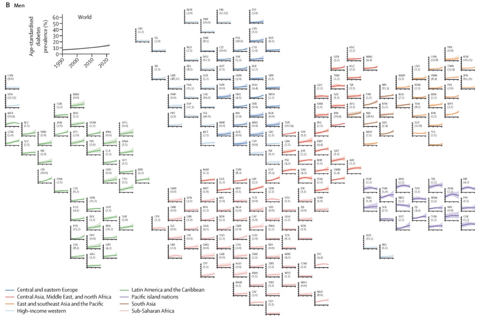
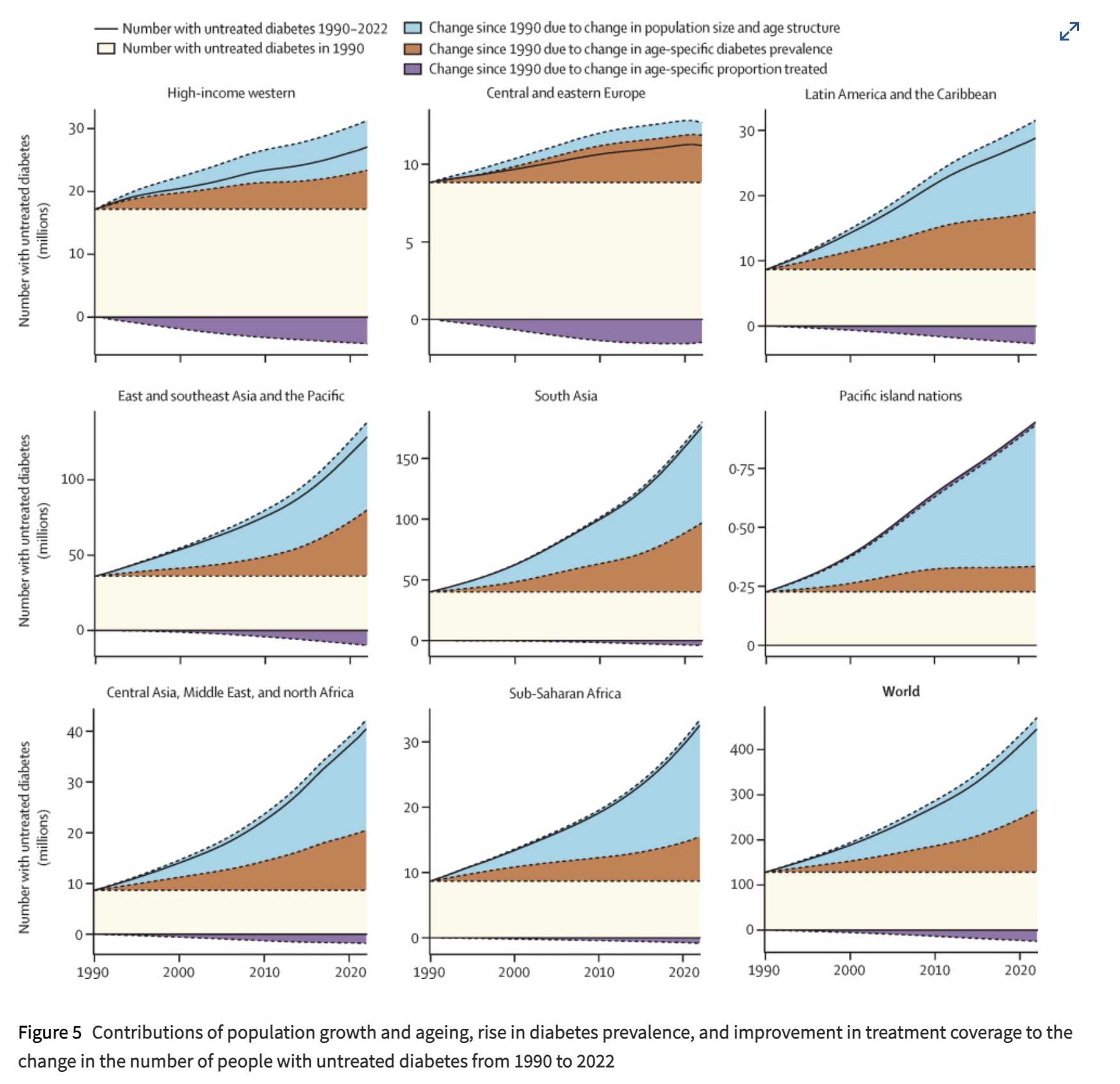
Source: https://doi.org/10.1016/S0140-6736(24)02317-1

The Top 4 Countries by rate:

  1. India 26%
  2. China 18%
  3. USA 5%
  4. Pakistan 4%

This is only accounting for tracked diabetes, so some of the areas might have larger numbers.

12
 
 
13


:: Additively weighted Voronoi diagram ::

I wrote this implementation many years ago, but I feel it didn’t receive the recognition it deserved, especially since it was the first freely available. So, better late than never—I’d like to present it here. It’s an algorithm for computing the Weighted Voronoi Diagram, which extends the classic Voronoi diagram by assigning different influence weights to sites. This helps solve problems in computational geometry, geospatial analysis, and clustering, where sites have varying importance. While my implementation isn’t the most robust, I believe it could still be useful or serve as a starting point for improvements. What do you think?

14
 
 
15
16
 
 
17
 
 
18
 
 
19
20


cross-posted from: https://lemmy.world/post/25580771

The visualization presents monthly global temperature anomalies.

https://svs.gsfc.nasa.gov/5190

21


[Nat Geo]

22
263
submitted 2 months ago* (last edited 2 months ago) by [email protected] to c/[email protected]
23
24
25
view more: next ›