this post was submitted on 15 Oct 2024
279 points (100.0% liked)
Fediverse
34993 readers
474 users here now
A community to talk about the Fediverse and all it's related services using ActivityPub (Mastodon, Lemmy, KBin, etc).
If you wanted to get help with moderating your own community then head over to [email protected]!
Rules
- Posts must be on topic.
- Be respectful of others.
- Cite the sources used for graphs and other statistics.
- Follow the general Lemmy.world rules.
Learn more at these websites: Join The Fediverse Wiki, Fediverse.info, Wikipedia Page, The Federation Info (Stats), FediDB (Stats), Sub Rehab (Reddit Migration)
founded 2 years ago
MODERATORS
you are viewing a single comment's thread
view the rest of the comments
view the rest of the comments
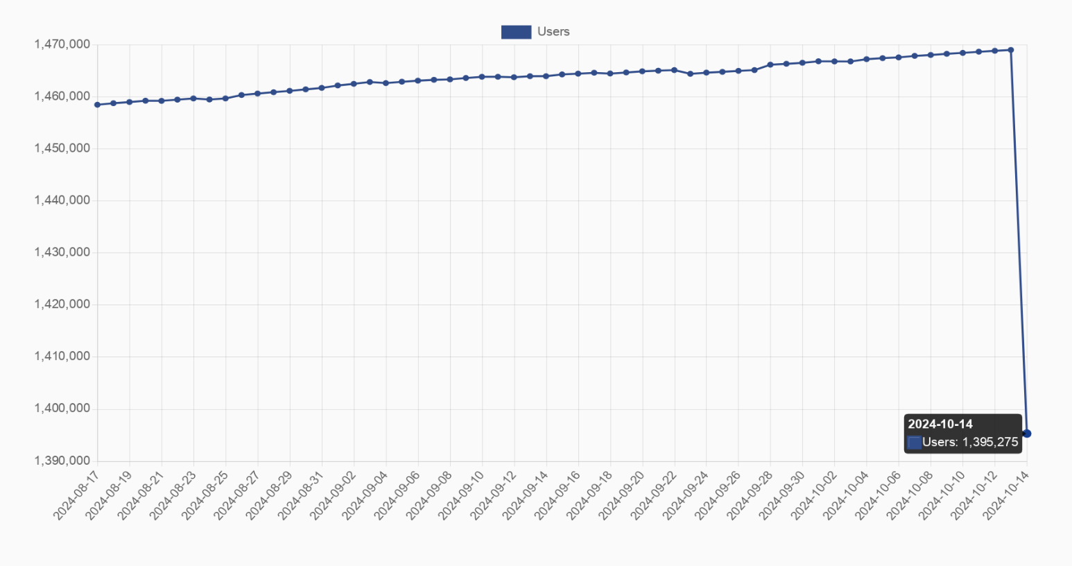
If you saw why people would criticise it then you’d… edit the post, recapture the graph with an accurate visual representation including the zero on the Y axis?
Well...
It's the only way to demonstrate the fall, of you did it at scale it would've even be noticeable.
5% is noticeable unless the graph is under 20 pixels tall. Even then, dithering or antialiasing techniques could make it visible.
There are people here who didn't even notice the axis and are confused. How do you expect everyone to notice a 5% drop lol.
Well if they didn't even notice an axis on a graph, they might be too stupid for a graph...
My point was only to say that 5% is very mich visible on a 0-100% graph.
My point is that it is hardly visible and doesn't show the exact numbers properly. I prefer the current style of graph for showing sudden changes if the previous data points isn't that important in the context. But everyone has their preference I suppose.
Or just inform the other adults to consult the axis for clarification.