this post was submitted on 03 Oct 2024
2 points (100.0% liked)
Data is Beautiful
2362 readers
1 users here now
Be respectful
founded 1 year ago
MODERATORS
you are viewing a single comment's thread
view the rest of the comments
view the rest of the comments
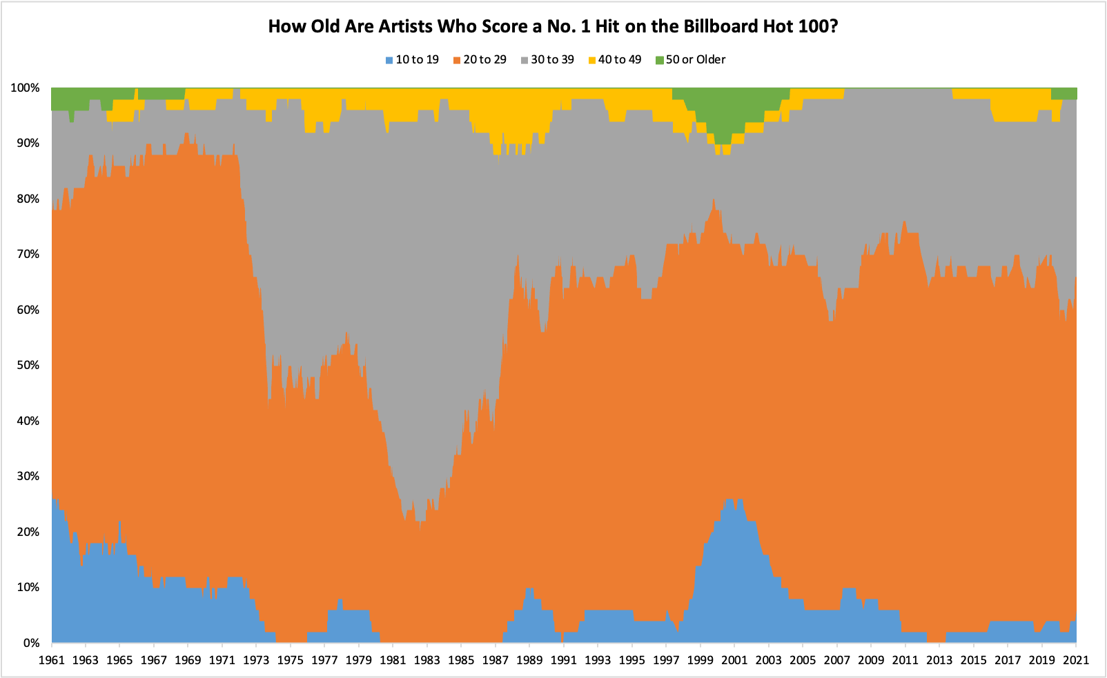
This isn't beautiful, it's borderline unreadable. A stack like this is a very poor choice to show changes in relative proportion over time. A simple XY plot with dots would be better.
chill out