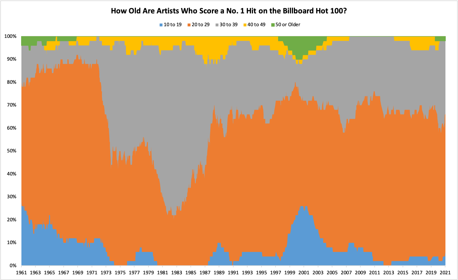
This isn't beautiful, it's borderline unreadable. A stack like this is a very poor choice to show changes in relative proportion over time. A simple XY plot with dots would be better.
this post was submitted on 03 Oct 2024
2 points (100.0% liked)
Data is Beautiful
1719 readers
1 users here now
Be respectful
founded 9 months ago
MODERATORS
Sounds like you just don't like 100% stacked column charts. This is their primary use case after all. I can't see how an XY plot would do a better job, wouldn't there just end up being a ton of overlap, making it hard to discern the differences between the smaller segments? Do you have an example where you think an XY plot represented this type of data better?
chill out
What happened in the 70s and 80s for artists in their 20s to lose their dominance so much?
They turned 30 and kept selling records :-)