
The photo is from Firefox beta for Android.
A community for discussion about Mozilla Firefox.
The photo is from Firefox beta for Android.
I think the worst part is the multi line text, it looks bad. They should stick to a condensed icon only view or a more spaced out view with text.
Hate the new menu with a passion. There's one feature I used a lot, "open in regular tab", that has been removed.
I think your firefox might be bugged, I'm on nightly and it looks like this for me:
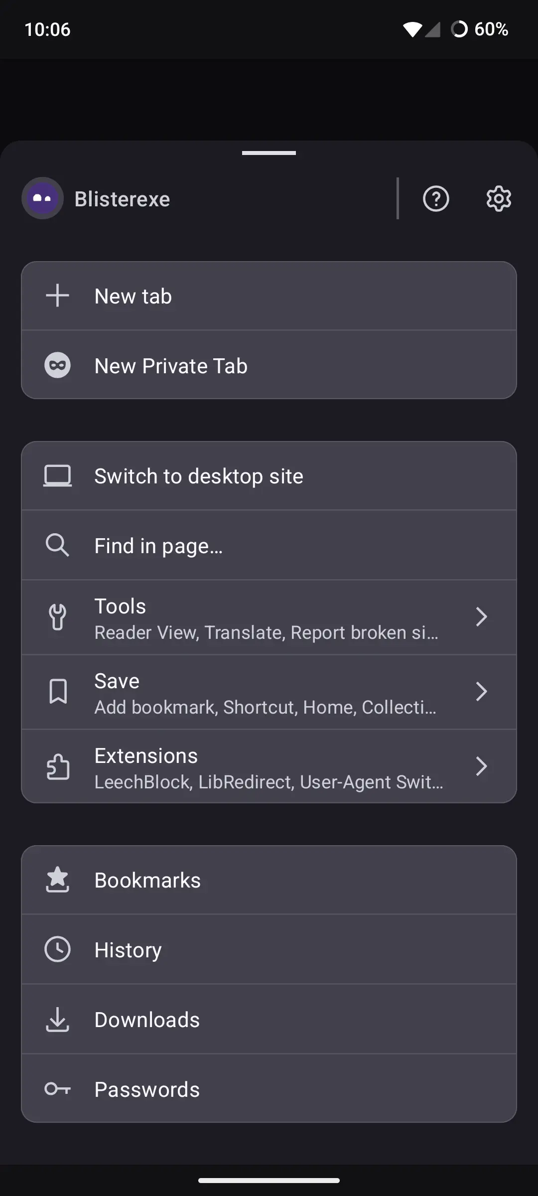
I think OP has a bigass font size.
So, once again, more ~~white~~ "grey" space and less content. Yay boo.

Wait, did the dev finally come back and fix sync for lemmy?
Hey this looks kinda cool. Can't wait for it to be stable.
No offense, but both of them suck.
I don't know who did Firefox hire from the Gnome team to redo their menu.
Tbf: Considering I still use the "old" design with the address bar and three dots up, and even enjoyed the short period where tabs were accidentally enabled for all Android devices... yeah, it sucks. Only the position of it though. I have all buttons at the top and am used to that, I don't want it to be at the bottom.
Oh wow. Why is your font so big?
Why not?
Because it looks too crowded and busy.
The font size is universal on Android.
Looks awesome. Can't wait for it to be released. 👍
Yeah Im not opposed. It's different but they keep playing around with it on nightly and beta.
Tbf, if I'm interacting with the menu I don't mind it being big and separated.
Exactly. Large tap targets ftw, but also Fitts's Law, of course.

You beat me to it
