website source (unfortunately, now dead)

neocities is lovely, as is the guy who makes it
(i'm particularly a fan of his ad block bar, although it can be done without js)
sexy, isn't she
i did hold off on posting it for a while actually because it's it's a bit potter-esque
but then i thought she doesn't have a copyright on round glasses; and why let arseholes ruin the context of nice art
thank tywele not me!
but if you like this, i feel duty bound to promote the entire f.n.i.c. but particularly [email protected] and [email protected]
website source (unfortunately, now dead)
yeah you did, don't worry
it was just a small semantic feature i happened to notice. i'm impressed you managed to get my meaning even though i apparently used the wrong phrase, though [edit: or possibly i didn't, i guess]
finally tywele, i've found something cutesy for you
it's cool to see two ships meeting at an oblique angle! normally in space they just conveniently happen to align with each other
used as an alternative cover of "Ethan of Athos" by Lois McMaster Bujold

sorry :(
Judging if something is pre or post apocalyptic, while allowing abandoned stuff to be pre-apocalyptic, feels more difficult.
yeah that's fair, that's why i do accept it's conjecture. i just go by the kind of "feeling" of the piece, but i know that isn't exactly something you can use
i've also just noticed i used "built from scratch" and "scratch-built" as opposites in that comment, which i imagine also isn't hugely helpful..
fair enough, it is conjecture either way
perhaps pre-apocalyptic vs post-apocalyptic is a better distinguisher? and i'd say this looks pre; but it could be recently post and the electricity's still running. so i won't fault you for being confused
i mean there could be people in a wasteland (exempli gratia) even though it's clearly post-apocalyptic, so i guess that was bad advice to give you
(or "assebly line", according to the url..)
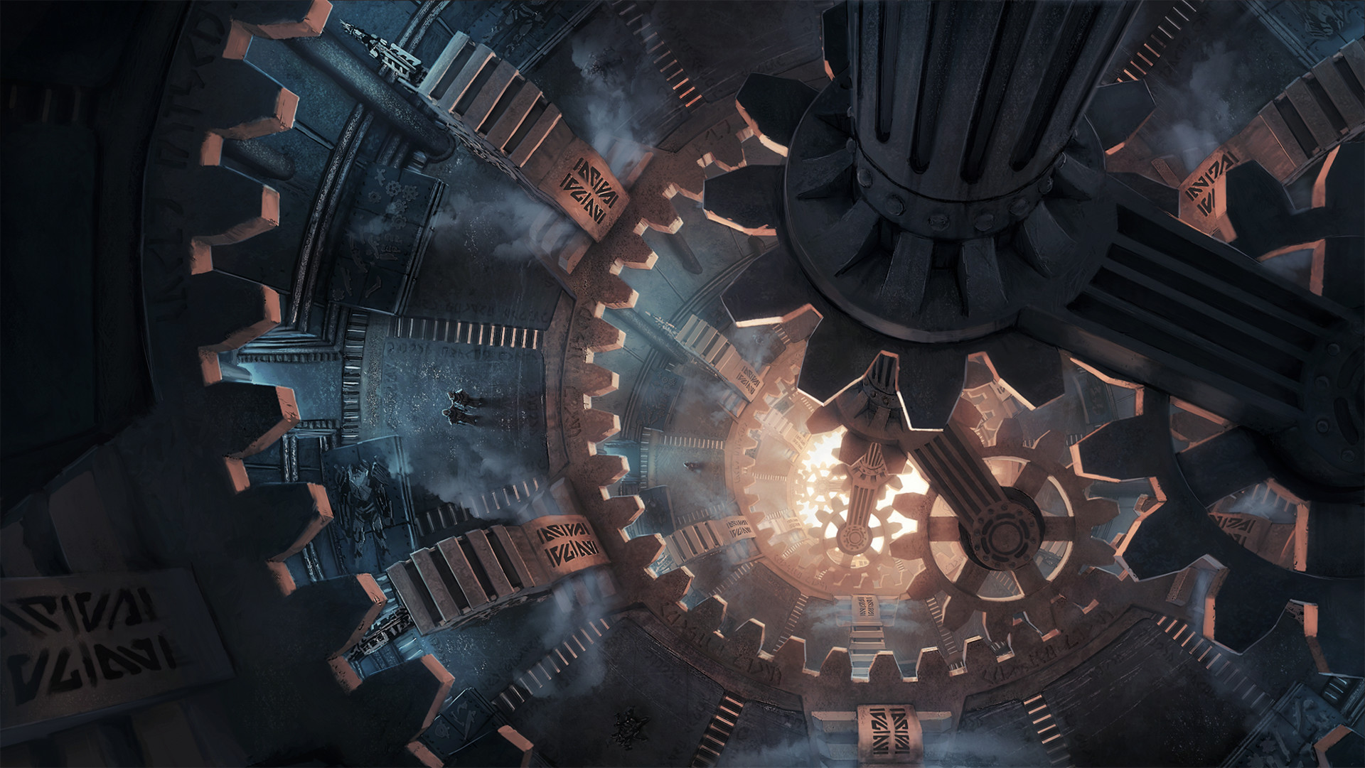
I created this steampunk illustration concept with a challenging perspective view, but everything is still made only in photoshop.
It was made for Skywind, as the assembly line of dwemer machines holding up with steampunk tendencies.
source: artstation site || artstation page || deviantart
artist's: web site || artstation site || artstation page || deviantart || artstation rss feed

ah see now this one i personally would have put in !imaginarydegradation
it's not unsuited to here, but to me it looks more dilapidated than abandoned^?^
i think it depends
i mean it looks shitty on my screenshot, but that's because it's a phone not a tablet. my eyes can move easier than my thumbs, so i'd rather glance than have to scroll twice as far
i disagree with empty space usually, but i don't disagree that it would be better filled with, say actionable buttons rather than text that needs to be read
¯\_(ツ)_/¯ i'd find it much better as it's more information dense. that's why apps have preferences.
but i was just pointing out that there's definitely a "sensible alternative"
artist's artstation page || artstation site || deviantart || artstation rss

source: deviantart || tumblr (fallback link)
artist's deviantart || artstation site || artstation page || tumblr

technically untitled, but used as the cover art of battle-train siege by mark william chase:
Here’s the cover art for my upcoming book, Battle-Train Siege, Book 1 of the Siege Chronicles (sans the title and author name). The illustration was made by Alejandro Burdisio, a fantastic illustrator of dieselpunk and early 1920’s style sci-fi vehicles and machinery. Check out his portfolio on ArtStation–the colors, details, and style are amazing!
source: m. w. chase's website || the mythania website
artist's artstation site || artstation page

used for the cover of vernor vinge's "A Deepness in the Sky"
now to me this looks quite a bit older than 2000; but that's what isfdb says, and who am i to argue?

website source (right side, just below the fold) || deviantart source
artist's deviantart || artstation site || artstation page [nsfw]

detail view:

twitter source || instagram source
transcript
a steel-plated tank with a number painted on the side, followed by a "spade" symbol. one armour plate is missing, making the number unreadable. behind the turret is a rivetted boiler and funnel

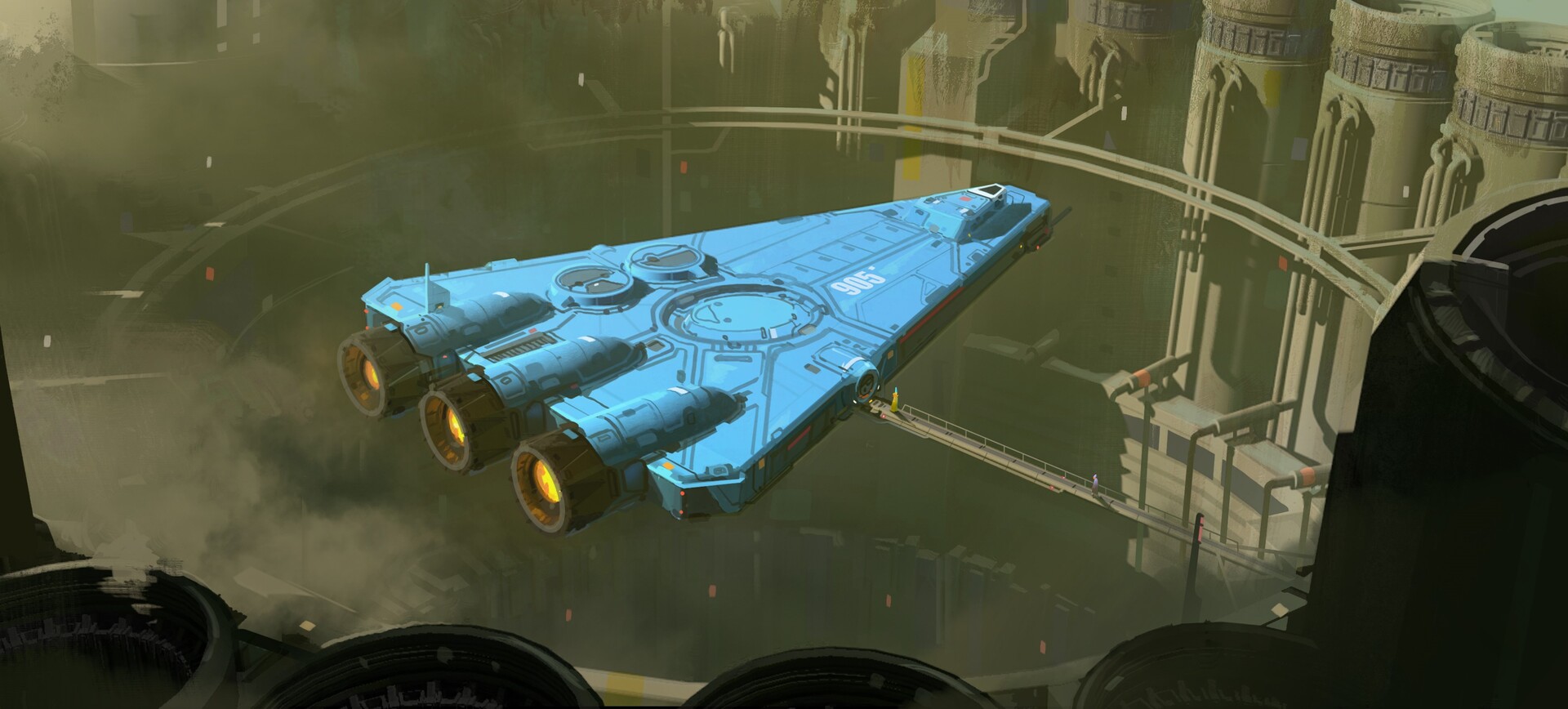
such a nice shade of blue. i like ships that have a bit more of an interesting palette than silver or white (like the freighters in ftl)
artstation site || artstation page || instagram source
artist's artstation site || artstation page || artstation rss feed
transcript
a flat blue triangular ship with three rear booster engines hovers above a round hole in the earth surrounded by pumping stations. it is attached to a long gantry, across which walk two people

d'you know what, i have no idea
i don't recognise it, but i could just not have been paying attention