Ok so I want to download this embedded PDF/document in order to physically print it. The website allows me to view it as much as I want, but is asking me to fork over 25 + tax USD so i can download the document.
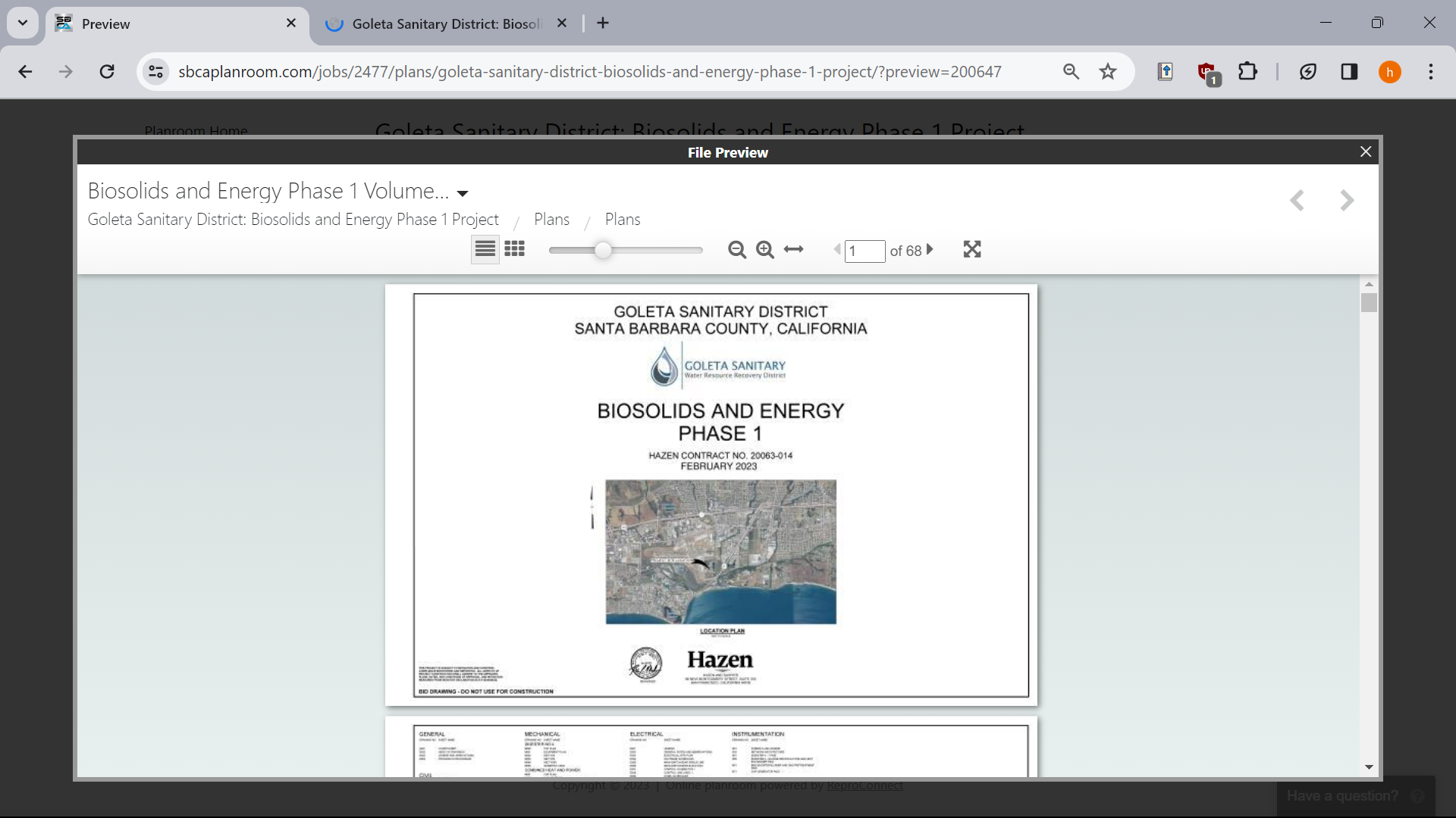
Obviously, i don't want to do that, so I try to download the embedded document via inspect element. But, the weird thing is it not actually loading a pdf, but like really small pictures of each page:
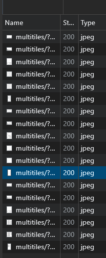
So, my question is basically how can I download this document in order to print it?
Although the bar chart is objectively better, especially the 3d ones, the pie chart is more intuitive and simpler to understand for a lot of people.
A halfway point in between is the tree map chart example
The color blindness problem can mostly be avoided. The tiny slices issues can be present in all three including the bar chart, for example if we have this data (these are percentages): 50 30 18 0.5 0.3 0.2 etc... The final bar chart would be either too long or too squished.
In a tree map chart, by moving the data/squares around you can avoid the problem of the squares being squished which the author is complaining about