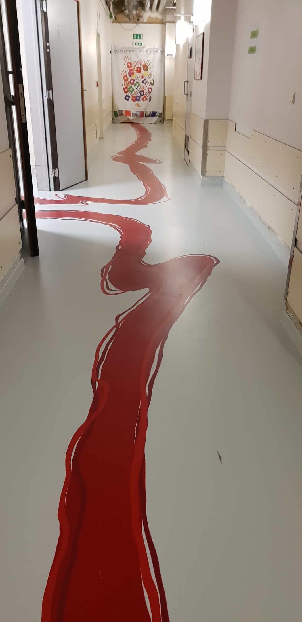
It's supposed to be paint, like for a kid's wing.
I like the design. Red is just a poor choice. Purple, Green, Orange, Cyan, Pink, and this would look really good.
Noticed that theres no equivalent to r/crappydesign here yet so i made one
It's supposed to be paint, like for a kid's wing.
I like the design. Red is just a poor choice. Purple, Green, Orange, Cyan, Pink, and this would look really good.
Why are the walls so bare?
Quick, splash some of that red paint on the walls, too!
It would be cute if it was done with children's handprints!
Cute or creepy?
Yes.
The dying hand prints I the far wall are a nice touch! They probably need more, you're right.
Don't dead. Open here
I hope other parts of the hospital use other colors and this is just the only unfortunate hallway.
Something something color theory
This empowering design reminds me of a children's hospital.
"look mom, that room is where they cut people open!"
Hopefully you're bleeding less when you leave than when you went in.
Well, I guess it makes navigation easier, but leading patients and family through the space with what looks like a blood trail just seems in poor taste.
As a Tumblr user I see this image 5 times a week.
Is this the picture tumblr had the color theory argument over?
Someone needs to check on President Shinra.
Bruh
At least the walls are not painted green.
Reminds me of the first Max Payne game.
It reminds me of Dementium.