What do we think of the new logo?
this post was submitted on 10 Mar 2024
314 points (100.0% liked)
Sync for Lemmy
15835 readers
1 users here now
👀
Welcome to Sync for Lemmy!

Welcome to the official Sync for Lemmy community.
The rules for posting and commenting, besides the rules defined here for lemmy.world, are as follows:
Community Rules
1- No advertising or spam.
All types of advertising and spam are restricted in this community.
Community Credits
Artwork and community banner by: @[email protected]
founded 2 years ago
MODERATORS
Look oddly more mature. I digg it.
A classy evolution of the previous logos. 👍🏽👍🏽
Happy with it!
Looks less reddity, which is good
Loving it dude!
Gorgeous
(シ_ _)シ
Love it! Great new look (ツ)
Absolutely gorgeous
👏
Classy.
I love the new up/downvote colors but when I swipe on a comment to upvote it's still orange/purple. Anyway to make that match the new upvote color?
This app is great! Keep it up!
Good catch.
load more comments
(5 replies)
You're on fire right now!
I know eh? This is how burn out happens though...
They seem to do bursts of progress and then take a break or at least slows down a lot; hopefully that is them balancing things, taking care of themself, and taking care of core responsibilities.
In Sync Ultra previews, when no image is available, the old colors are still shown:
Oooh good spot cheers
Swipe left on comment/post to upvote still the old orange colour. Otherwise, looking great!
Fixed for the next release.
Great point, it would be ideal if the swipe animation color matches whatever you pick in the settings.
LJ is coming back and is absolutely crushing it with these updates. Thank you, sir. (シ_ _)シ
Having an annoying bug where regardless of whether I change the upvote or downvote colour, it is the upvote colour that gets changed.
Just fixed and pushed the patch live!
The blue looks nice
Love the new logo, but especially LOVE the option to change upvote and downvote colors!
What does this setting do?
Settings shortcut: Comments > Delimit scores with a bullet point
Toggles this:

Subtle, thanks.
It was great on Reddit when usernames would end with a dash and so it seemed like a comment had a negative score.
load more comments
(1 replies)
It does what it says on the tin.
You can toggle it and compare the differences.
You can toggle it and compare the differences.
You'd think so but I didn't notice
Ljdawson you crazy sunuvabitch you done it again! Is there no end to how you kill it each time, Sync is just the best!
(シ_ _)シ
Not sure if it's just me, but now upvotes are blue and down votes orange in both the button color and the vote count color after voting. Seems backwards? I'm used to orange being upvotes and blue being down.
Oh, you must have missed the whole conversation here: https://lemmy.world/post/12922184
There was a whole thing about it. This is how Lemmy itself does it, so Sync changed to match.
Edit to add: 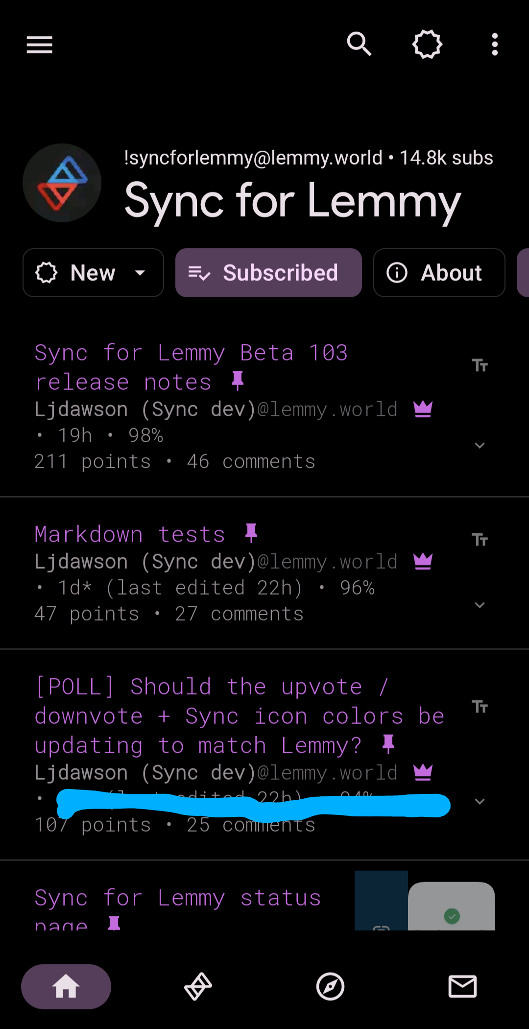
Oh that's weird (that Lemmy is reversed I mean). I guess I can just customize them back so no big deal. I kept getting confused thinking I accidentally downvoted stuff.
That's fair, and why there's the option included to change the colors back 😁
Took me a min to get used to, since I don't really use the web ui much, but I like the colors and it makes more sense to me to follow the colors that actually match the rest of this platform instead of that other one.
I agree that consistency is good, so the change is probably for the better. For me though, the old way makes more sense when considering the nature of the platform: orange for "hot" and blue for "cold". Plays better into the sorting algorithm of the frontpage for me.
Given we already have an app icon chooser implemented, could we get an 'old' icon that uses red/blue for up/down? You pretty much just have to rotate the existing icon 180
Do you think you'd be able to add a means of embedding images in a comment, please? We're pretty close with the link feature, but it just needs an exclamation mark for it to embed.
Thank you!
load more comments
(1 replies)
The post editing update is amazing.
view more: next ›