Alt text:
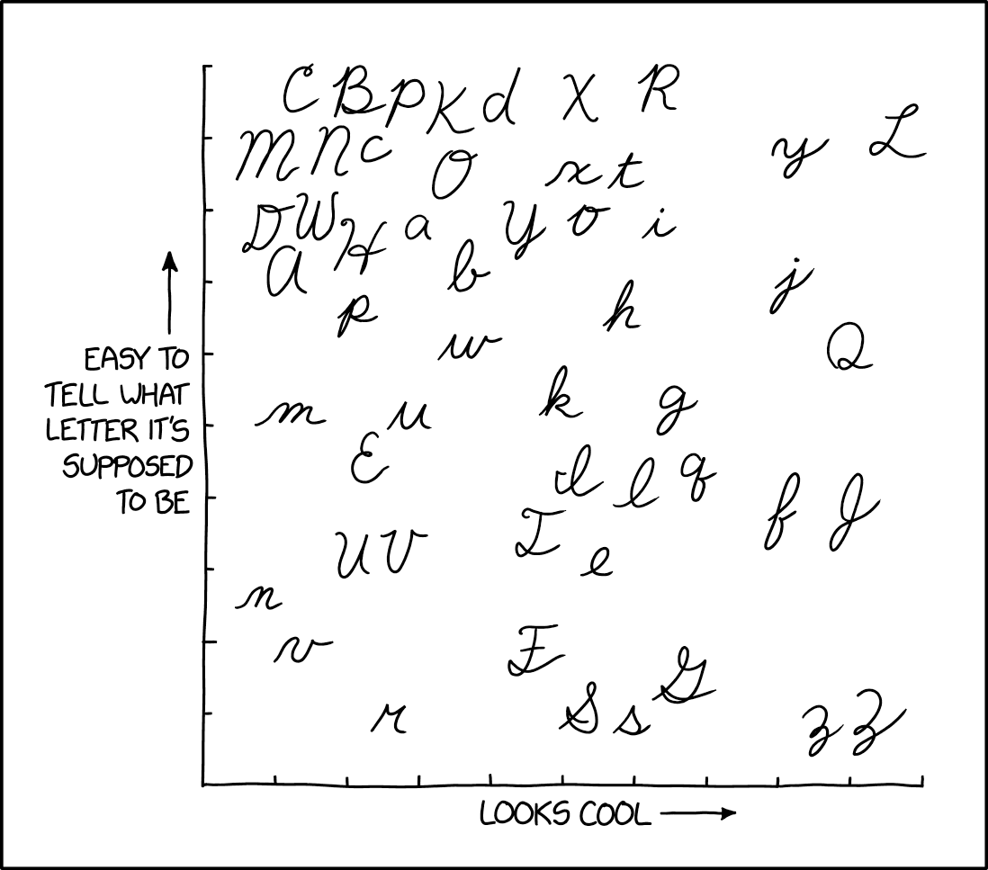
𝓘 𝓽𝓱𝓲𝓷𝓴 𝓬𝓪𝓹𝓲𝓽𝓪𝓵 𝓛 𝓲𝓼 𝓹𝓻𝓸𝓫𝓪𝓫𝓵𝔂 𝓽𝓱𝓮 𝓶𝓸𝓼𝓽 𝓯𝓾𝓷 𝓽𝓸 𝔀𝓻𝓲𝓽𝓮, 𝓽𝓱𝓸𝓾𝓰𝓱 𝓵𝓸𝔀𝓮𝓻𝓬𝓪𝓼𝓮 𝓺 𝓲𝓼 𝓪𝓵𝓼𝓸 𝓪 𝓼𝓽𝓻𝓸𝓷𝓰 𝓬𝓸𝓷𝓽𝓮𝓷𝓭𝓮𝓻.
A community for a webcomic of romance, sarcasm, math, and language.
Alt text:
𝓘 𝓽𝓱𝓲𝓷𝓴 𝓬𝓪𝓹𝓲𝓽𝓪𝓵 𝓛 𝓲𝓼 𝓹𝓻𝓸𝓫𝓪𝓫𝓵𝔂 𝓽𝓱𝓮 𝓶𝓸𝓼𝓽 𝓯𝓾𝓷 𝓽𝓸 𝔀𝓻𝓲𝓽𝓮, 𝓽𝓱𝓸𝓾𝓰𝓱 𝓵𝓸𝔀𝓮𝓻𝓬𝓪𝓼𝓮 𝓺 𝓲𝓼 𝓪𝓵𝓼𝓸 𝓪 𝓼𝓽𝓻𝓸𝓷𝓰 𝓬𝓸𝓷𝓽𝓮𝓷𝓭𝓮𝓻.
My cursive looks like a 10yr old wrote it, which is about the last time I actually wrote in cursive
Lowercase m, n, u, v, and w are confusing as shit when placed next to or near each other.
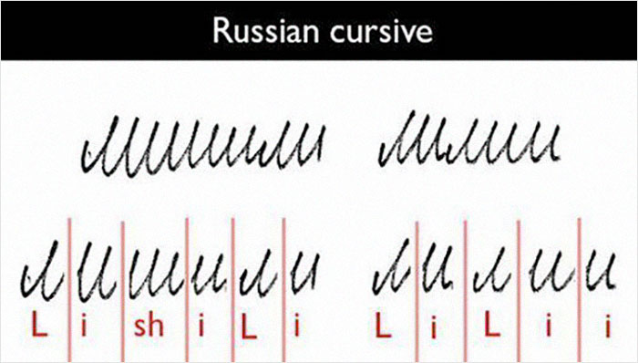
Try Cyrillic cursive.
So Donald Trump has been signing his name in Russian this whole time? It all makes sense now!

Good god.
I remember coming across a similar comment chain, and someone brought out cursive Hanzi, and everyone lost their minds.

this feels like a shitpost and i wont fully believe it until - i dunno when.
No, that's true. However, putting lines under e.g. the ш makes it a bit more readable.
I do not agree that uppercase G is easier to decipher than uppercase S
They're both pretty fucking bad.
nothing in this life feels better than writing a cursive f. i put my whole arm into it. those things are the highlights of anything i write
You may be cool, but you'll never be "Capital L" cool...
Today is you 𝓛ucky day.
Let's be honest. You didn't like learning cursive, you didn't like having to write full-ass papers in cursive because the computer lab was always full as a teenager, and you don't like writing cursive now because it means you probably have to borrow a pen from somebody at work who never washes their hands. Sincerely, a 45 year old.
I recently found an old letter from my grandpa to my grandma during the war in Old German handwriting. A lot of spikes. Decided to learn to read it. Nice journey, I recommend. (Not necessarily old GERMAN handwriting, but, you now, old handwriting in your mother tongue).
German Kurrent is almost an entire alphabet on its own. Like how the hell can you read this https://upload.wikimedia.org/wikipedia/commons/thumb/6/65/Lessing_Kleist-Brief.jpg/800px-Lessing_Kleist-Brief.jpg
And then they also have Sütterlin which is almost alien https://upload.wikimedia.org/wikipedia/commons/1/1b/S%C3%BCtterlinschrift.png
"Three rings for the Elven Kings under the sky..."
For Kurrent the umlauts next to the capital letters looks identical to the small e lol
that's because they are, umlauts came from writing vowel digraphs as the first letter with the second letter above it, for example ueber/veber -> uͤber/vͤber -> über/v̈ber -> über (although über in particular didn't actually originally have the spelling ueber). "e" turned into two lines, which now is represented as two dots/a diaeresis on most computer fonts. that's why, if you don't have access to diacritics (e.g. on technology), you write ä/ö/ü like ae/oe/ue (and why you have names which are spelled like Goethe instead of Göthe)
I ended up kind of creating my own cursive "font" because I thought several of the choices for letter shapes were, in graphological parlance, "Just completely fucking retarded." Like the lowercase S being a slightly pointy loop. I devised my own capital T as well, and jettisoned that Q that looks like a 2.
I wrote in completely illegible cursive until about halfway through college when I started using a laptop for all assignments. On a decent keyboard I can peak at 104 wpm. On the very rare occasion I do have to pick up a pen and write with it anymore, I'm usually jotting down measurements or something, or slopping out some squiggles that will just have to suffice as my signature.
I don't see teaching cursive to children as a particularly valuable usage of time, at this point it might be worth teaching them to read it, but proficiency in writing it is not valuable.
They're all easy to read when you know cursive.
insert language is easy to read when you know insert language
I think part of the problem lies in how cursive directly derived from print letters so shit like S, Z, and r makes you wonder who came up with this.
Serious question for people younger than me: How did you come up with a signature if you didn't learn cursive?
just write your name really fast without lifting the pen
I just do a lil scribble and call it a day. Signatures are kind of stupid anyway.
I wonder how much the placement of the uppercase L stems from Randall Munroe's own memories of Far Side comics with the "Larson" signature.
Lowercase b should be lower on y axis
Honorable shoutout to words that have "br"
Looking at this, while there is some overlap, it's very apparent that US cursive is not the same as Swedish cursive. E.g. lower case x starting from the top? O_O