QUEER UP 🔥🔥🔥
Images of text-designs, that are barely readable due to the placement of the words or letters
Please indicate which post is original by writing "OC" and properly credit stolen posts.
Please mark NSFW posts properly, don't spam, yadadadada
QUEER UP 🔥🔥🔥
Queer up buddies
Based
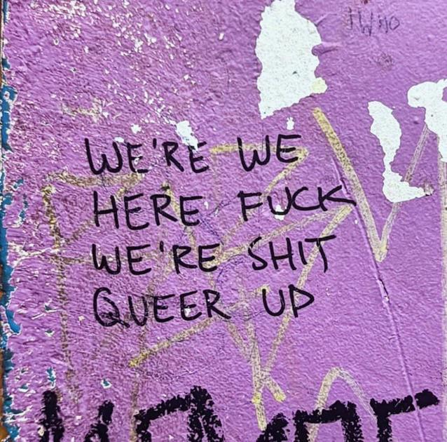
"WE'RE WE!" -Redundant, but yes.
"HERE FUCK" -Like, right now?
"WE'RE SHIT" -Well now I'm not sure I wanna participate in that last bit.
"QUEER UP!" -Is... Is that a threat?
WE'RE WE!
*HERE. Fuck. We're shit.
QUEER UP!
it's not a threat, it's an order.
Alright, everybody, queer up and roll out!
This one's just... I don't know. How did they get even halfway through it without immediately noticing the mistake?
They ran outta space
I particularly like the reading:
"We're here, we fuck, we're queer, shit up"
Queer up is kind of cool, and it kind of almost rhymes with “we’re fuck”
Its kinda fire no matter how you read it. WE ARE WE, HERE FUCK, WE ARE SHIT. QUEER UP
It kinda works tbh. I could see that used in some dance song.
Incredibly based
What is it based on?
The placement of the words make it a double entendre.